Review: Nowhere Men #5 – Eric Stephenson & Nate Bellegarde

NowhereMen_5.jpg5Nowhere Men takes on an interesting slogan early on in its run: “Science is the new rock and roll”. It’s a saying of one of the main characters and seems to be a tenet that this group of scientists take in stride. Less like a typical think-tank, and more in line with The Beatles, this group of men are rock stars – big egos all formally part of this global corporation known as World Corp. Set many years after their much publicised break up, Nowhere Men follows not only this original cast of science superstars, but the mysterious crew of a forgotten international satellite orbiting the earth, as they find themselves exhibiting strange powers.

Eric Stephenson and Nate Bellegarde’s tale of corporate secrets and exciting sci-fi is both intriguing and original, and after a brief hiatus returns with issue five to follow the space-station’s crew adjusting to their new powers, as the former members of News Corp battle each other to track them down. It’s slower than the past couple of issues, as many of the characters find themselves still caught in the same area they found themselves in for the past two issues. While it does allow us to further familiarise with each character’s new powers, it is beginning to drag. Hopefully the reveal of a new rival character in the intermissions, as well as the development at the end of the issue can remedy that.

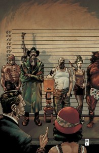
Speaking of intermissions, this is where Nowhere Men shines. Each takes on the form of posters, magazine articles, or artwork that are not only great to read, but both develop character and the world of Nowhere Men as well. Interviews and gossip pieces give back story, while also giving the story a sense of time and place. This is a world that worships science, and has given these men celebrity status, also crucifying them when they fail. It’s a neat parallel to our own celebrity infatuation.

It also helps that these posters are expertly designed too. Each feels like a product of the 60s and 70s, and with some definite nods to artists of that era, looks authentic

Bellegarde’s panel art is also great. His distinct character design manages to portray the wide range of the cast nicely, combined with a nice flat colouring thanks to Jordan Ballaire gives this series a distinct feel. If I could frame each cover in the series I would.

Actually, half of the art in Nowhere Men I’d frame, if it wasn’t great to read. Cool intermissions aside, Stephenson’s tale is really taking shape, and while it may be taking a while to get there, I can’t wait to see how it turns out.
Review: The Bounce #1 – Joe Casey, David Messina

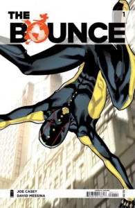
The-Bounce_11-300x461I’ll admit, I was kind of looking forward to the first issue of The Bounce.  Despite the vague description of issue 1, and the costume looking like some kind of cross between Ronin and Spider-Man, I was intrigued by the idea of a hero who finds motivation in superheroing, but the rest of the time doesn’t really do much.

Meet the ultimate slacker superhero for the 21st Century! Jasper Jenkins is a super-head AND a super-hero! He’s relatable AND reliable and he’s embarking on the adventure of a lifetime! The sensational debut of the new feel-good hero of the decade! You can’t afford to miss it!

Jasper Jenkins’ (The Bounce) has a power that is exactly what it sounds like.  He bounces.  The setting is something that’s clearly trying to appear like the ‘real world’.  So we have a hero with an absurd power, in a contemporary, grounded setting.  Nothing new to see here.

Jasper is a slacker and a stoner.  That’s fine, there are plenty of examples in pop culture featuring stoner protagonists that are endearing and witty (see Harold and Kumar, Pineapple Express), or filled with dark comedy and social commentary (Clerks, The Big Lebowski). Sadly, The Bounce is neither of these.

It’s not hard for me to put my finger on why I didn’t enjoy this book.  I really really wanted to, but I ended up quite intensely disliking it, and it had very little to do with the lack of real story, or even my inability to empathise with Jasper.  I didn’t like The Bounce, because it’s trying too hard to be cool.

The book opens with three pages of Jasper, his roommate, and a bong.  How original.  The profanity is also an issue.  While I’m not at all offended by it – that would be hypocritical – it’s incredibly tiresome.  I get that this book is aiming for a certain market, but I’m scratching my head to figure out exactly what that is, considering I’m fairly certain that I fit into the demographic.

So the writing doesn’t have much going for it, it’s not that original, and it’s trying too hard, which is a shame because Joe Casey has done some great stuff in the past.  What about the art?

Ehhhh… it’s okay.  Again, nothing new to see here.  The design is boring, and David Messina’s art, while technically good, isn’t anything special, and lacks any real sense of movement.  I do enjoy his ability with perspective though, and the background cityscapes were probably what I found most interesting about the entire issue.

In summary, and in relation to the summary, The Bounce doesn’t really do what it says on the box.  I didn’t find him relatable, I would actually rather he were unreliable, as that would probably make him more interesting, and I’m really confused as to how this book is supposed to be ‘feel good’.  The only part of the summary I found to be accurate was the slacker bit.

All in all The Bounce gets a D-minus from me.  Would not recommend.  I was originally going to give #2 a go, just to see if it needs some time to find its feet, but you know what?  I can’t be bothered.

Mini-Reviews: Todd The Ugliest Kid, Hoax Hunters and Judge Dredd

todd-ugliest-4Ahhh, the best time of the month when my monthly stash of non-digital comics arrives. Here’s my brief thoughts on what I’ve read:

Hoax Hunters #9: I’ve been threatening to stop reading this for a few months now and this flip-book doesn’t do much to convince me otherwise. It’s a ghost hunting story this month so at least it’s easy to follow and I like the flip-book concept (one half shows the TV show version of events, the other what actually goes down). That said, the resolution of the story is lame. I’m done with this title as of issue #10 unless something amazing happens.

Judge Dredd #5 and #6: I was starting to waver on this title but these two stories have me back on the wagon. New stories told in the classic Dredd way. Think of it like a 2000AD Mag in a glossy comic. Speaking of which: who’d like to see IDW do a Rogue Trooper series?

Todd The Ugliest Kid on Earth #4: Three words: strength-to-strength. Now with talking cockroaches.


Review: Saga #12 – Brian K. Vaughan & Fiona Staples

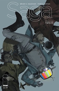
saga-12I don’t think I have ever encountered a series that has so consistently been impressive as Saga has been. The perfect mix of sci-fi adventure, family drama, and Lost-esque cliffhangers (which coincidentally was also something writer Brian K. Vaughan was a producer on)  have lent to a tale that is original and incredibly smart. Now at the end of its first year with the release of  Saga #12, this title shows no sign of slowing down. Writer Brian K. Vaughan and artist Fiona Staples manage to prove that even in an issue that doesn’t incorporate the main cast of characters, it still manages to impress.

Saga follows Marko and Alana, two people from different sides of an intergalactic war that are fleeing their own people. That’s because of their child, Hazel, who for reasons unknown is wanted by each side. One of the pursuers, Prince Robot IV, tracks the group to Alana’s favourite author D. Oswald Heist, in an attempt to intercept the group before they get there. Don’t worry if that doesn’t make sense – go read the other eleven issues, and then come back to me.

You’re back? Okay good.

It’s to Vaughan’s credit that he can fashion an issue almost completely without the main cast, and have it still remain of the highest quality. Aside from the cliff-hanger at the end, Marko and Alana don’t feature at all. Prince Robot IV is a sympathetic villain – he’s just learned that his wife is pregnant, and he is being forced out of his homeworld to hunt people. He’s just a man who served a tour of duty and then thrust back out into the war. It grounds the character in reality, and his motivations for getting the child are purely professional – he just wants to be home with his wife.

D. Oswald Heist is also portrayed fantastically as a disillusioned author who has become a recluse, only allowing “ladies who bring him bottles” to visit. It’s great that the team chose to portray Heist as normal and sarcastic, as opposed to being a typical scholar, but I guess if you’d been paying attention to the excerpts Alana read out in previous issues you’d see why.

Despite Vaughan’s portrayal of Prince Robot IV, the real emotional content comes from a character’s introduction (and death) early on. While the character only appears in a few panels, it still stings when they finally (and gruesomely) pass on, speaking volumes to Vaughan’s ability to make readers care.

Staples’ art, per usual, is fantastic. Robot’s television head allows for Staples to use her artistic skills to convey emotions differently than making them pull a face, and it really lends to how the character thinks, and where his mind ends up in times of stress. Her character designs are also smart, as the cute creatures that Robot encounters only adds to their personality. If you ever needed an example of purely digital art being a viable concept, pick this book up.

So while Saga takes a brief hiatus, with solicitations not mentioning it again until after July, it manages to leave on a high note – as a well thought out cliff-hanger that will keep readers going until it returns. As for me? I’ll be re-reading it again, because Saga is seriously a tale you don’t want to miss.


Review: East of West #1 – Jonathan Hickman and Nick Dragotta

East-of-West-issue1-coverEast of West is one hell of an interesting comic, and that’s just the tip of this beautiful iceberg.  Jonathan Hickman and Nick Dragotta have brought us a world that, while set in what would be our history, looks more like our future…and our past.

We open on a circular arrangement of stones, thin and tall, like fingers attempting to wave their tips at the stars.  In the centre, we see a stone placement, also a circle, with four triangle depressions around the edge.  An explosion of light, bluster, energy and smoke shoot out from this, and as it slowly drops to a layer of thin smoke we can make out some movement within one of the triangle fixtures.

Small hands tear through it and eventually a body pulls itself out, abnormal tubing and the like attached to his chest.  Three others rise from the other triangles – a female and a larger male, all children of a darkly twisted nature.  These are three of the Four Horseman of Apocalypse and, as one can tell from the group of kids – they are missing a member.  Namely, they are missing Death.

We move into a perfectly fitting introduction of the universe this story exists in, and some of the major events that sent it in that direction.  A country already divided due to violent disagreements.  The formation of ‘The Endless Indian Nation’ and a Civil War interrupted by political change, morphing into a double-headed battleground.  It is in this setting that what looks to be a ‘comet’ crashes from the sky, forever changing the Earth as we know it.

We are introduced to the mysterious and unsolvable ‘Message’, one that began with a Prophet and a Chief of Chiefs telling their parts of this message, then falling dead to the ground upon completing their piece.  The final piece – an addendum to exiled Chinese Leader Chairman Mao Zedong’s ‘Little Red Book’ – completes the missing portion of the message, and thereby solving it.  The story within the message?  The story of the end of the world.

With the re-marking of territory and the forming of the “Seven Nations of America”, we leave the ‘flashback’ and are left with a prophesy – a lone man, a ‘broken sparrow’, and a ‘Son of Night’.  “The first of four…” – the end of everything.

Enter the present day, and we’re at a bar known as ‘The Atlas’.  Our lead character walks in, his two companions in tow.  What strikes one right away is their skin color – our lead in all white clothing (including an awesome hat), with bright, bleached-white skin.  A large American Indian man with similarly colored skin.  A woman with skin a dark black, contrasting strongly against the rest of the crew. The team is there on important business, finding a man who had been hired by an unknown party to track them down.  The three use violence (and a little bit of a ‘vision’, showing the man who exactly he is dealing with) to convince the man into giving up his boss, and they take the name and location of their prey away with them.  Whoever it is, they are in ‘The White Tower’, which one can already assume is the seat of some form of Government or another.  With talk about how the Tower is warded – “Bones and Bonded”, as they call it – and the fact that this would hinder any approach by his companions.  Deciding to all meet soon at the ‘Golden Bridge’, our protagonist heads off on his own, jumping onto the back of an insect looking creature and speeding away.

We return to the three remaining Horsemen, finding they have killed loads of people, piling the bodies high into a massive pile.  As they sit and otherwise hang out on this mess of gnarled flesh, they joke about killing, and how hilarious it can be when people react to being murdered by what seems in every way to be only a 5 year old boy.  They exchange quotes and laugh a good while, when they are stopped by the sudden movement of a man – still alive among the pile of carnage.  The three joke with him, asking if he knows any jokes, all while the man begs for his family and for help.  This whole scene is hilariously demented, and is made more so by the characters themselves – a group of three ‘children’.  It is here that we learn the three remaining Horsemen are Famine (a young girl with deep black almond shaped eyes and haywire hair), War (the youngest and smaller looking of the trio), and Conquest – a larger boy in what almost resembles a form of armor.  Eventually, the man learns who these three are, and point out that there is only the three of them.  This angers Famine, and she violently snuffs the voice out.

Our ‘hero’ makes his way not only to the Tower but also – somehow – into its innards, where he comes face-to-face with his prey.  After a lengthy conversation about the nature of his being there, our main character announces that he, himself, is Death, and that he is there to pay the man back for taking something from him in ‘the Badlands’.  We are left here with a scene of gore, and many, many questions left asked and unanswered.

I really enjoyed this title.  It has a similar feel to comics like “Preacher”, and this is in tone as much as in subject matter or setting.  Speaking of the setting, this world is an interesting mix of old and new, something well explored in the ‘Steampunk’ universe – but with a style and a look completely its own.  Let’s call it “Dirtpunk”.  High tech mixed with standard dress and buildings of the day, the White Tower being an insanely large mecha-city while other surrounding areas look right out of a John Ford western.  It works, and the scale is kept even, never dipping too far into either idea.

The artwork is stunning, and one of my favorite points of this book.  It’s just damn beautiful, with thoughtful lines taking full advantage of the unique and interesting character designs. The color art is outstanding, and can dip and dive in all spectrums and schemes, from the lightly phased out look of the ‘backstory’, to the excitingly bright and rich colors found in the remainder of the comic.

The script for this comic finds a nice point between beginning a story arc with rich characterizations and a strong sense of where we are – all with leaving us enough questions to want to know more, but not so many that we feel lost or confused in any way.  The dialogue is as tough and is well written, with far less ‘tough guy’ posturing than you might expect.  The characters aren’t all that layered or filled in, but this is the opening book and what we get here is more than enough to get a grasp on who these people are.

My favorite parts of this title were with the Horsemen ‘children’.  The darkly funny scenes, along with their own confusion in regards to humans and their emotions, is a sell on its own.  Add in the world Hickman has wrapped around it all, and you have yourself a damn fine comic.

Review: Todd, The Ugliest Kid On Earth – Perker and Kristensen

todd-uglykidThis new release from Image comics is something a little outside the superhero schtick to say the least. The central character, Todd (surprise!), is a kid who’s constantly bullied and is considered so ugly by his mother that he’s forced to wear a bag on his head. Add a ‘mutton dressed as lamb’ mother, a heavy drinking father, a neighbourhood bully and a child serial killer and you have the foundation for an interesting comic series.

This is a story that has the potential to veer solidly into Archie / Dennis The Menace neighbourhood sitcom territory but it manages to achieve exactly the opposite – an edgy, funny, adult comic. Sure, there are some low moments where the story skids into stereotypes but they are far outweighed by the dark humour and a pretty stark portrayal of Todd’s day-to-day life. M.K. Perker’s art is a great match for the story and Kristensen’s writing is more than solid, including a handful of actual laugh out loud moments, something I don’t experience very much in comics.

Todd, The Ugliest Kid On Earth is now on my monthly pull list – kudos to Image Comics for giving series like this a platform to grow. You can buy the digital version here, otherwise hit up your nearest comic shop for a copy. I have a feeling I’ll be sorry to see this title end after its slated four issues.