Captain America: Living Legend #1 – Diggle/Granov

living-legend
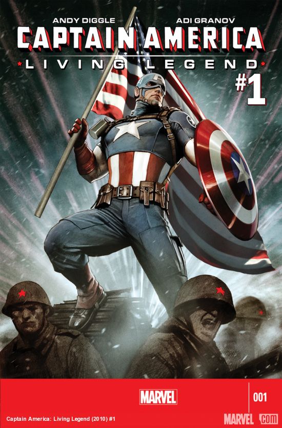
What is Captain America: Living Legend?

Well, three years late, is a good place to start. This four part miniseries was supposed to be released in the lead up to the Captain America: The First Avenger (albeit under a different title), and it’s been shelved ever since. Now, with Captain America: The Winter Soldier movie around the corner, I guess they figured the right time is now.

I’ve been looking forward to this title for a while, mostly because I dropped Remender’s Captain America on issue 5, not caring for his problematic, pointless, and at times out of character story, or for JRJR’s ugly art. All I was looking for in this book was a decent story and solid art – anything to wipe what’s happening in the character’s current ongoing story from my memory.

On this front, Living Legend delivers. It’s not a great title by any means, but it’s engaging and interesting enough to have me looking forward to the next issue. Diggle’s writing is solid, although the story lacks cohesiveness at times, and it’s nice to see Steve back in character again.

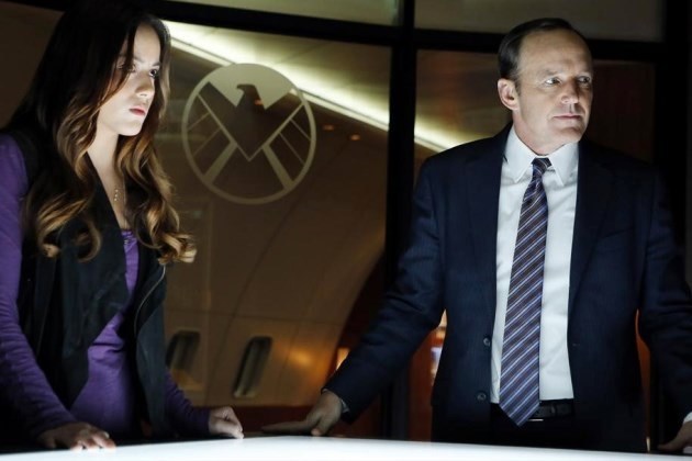
The story begins in 1945 Germany, skips through Soviet era Siberia, and ends up in the present day. From WWII, to space, and finally the Helicarrier. Much of the start of the issue is taken up introducing the character who will be the main protagonist, and this doesn’t leave a lot of room for Steve, but this isn’t necessarily a bad thing. It’s a good set up for the next three issues, but if #2 doesn’t feature a less disjointed narrative, then the title may be in trouble.

The issue is illustrated by the celebrated Adi Granov. He’s best known for ultra-detailed work, and that’s certainly what you can expect here. Fans of Granov’s work will be excited to see a full issue featuring his art. Sadly, I once again found myself decidedly underwhelmed. I have never been a fan of Granov’s, and while I can appreciate the technical skill, I always find it leaving me cold. His lack of expression (and I don’t mean facial) and movement, as well as his characters looking placed in their environments, rather than interacting with them, is something I struggle with. The page design is also uninspiring – although he does take some risks in places, it just doesn’t quite work.

Living Legend is also filled with his trademark teeth baring expressions, as well as almost grotesque looking characters. I was also unsurprised to see Sharon Carter looking exactly the same as just about every female character Granov has ever drawn, just with blonde hair. Interestingly, I found the less detailed panels far better. When he takes the focus off creating something photo realistic, his work can really shine.

Living Legend is a little bit of a let down, but far, far better than Remender’s current ongoing. The sci-fi element looks like it could pan out to be interesting, and Andy Diggle’s writing is nothing to sneeze at. Those who share my opinion of Adi Granov’s art, may be pleased to hear the rest of the miniseries will be illustrated by Agustin Alessio, so here’s hoping there’s more dynamic movement between panels next issue.

Over all, definitely worth a read if you’re a Cap fan, but don’t set your expectations too high.

Review: Agents of S.H.I.E.L.D. Season 1 ep. 2: 0-8-4

SHIELD-6After the cliché laden clunker that was the pilot episode of SHIELD, you can imagine my trepidation going into the second episode. Despite my concern, however, I do like to give every new series three episodes before deciding whether or not I’ll continue watching on a week-by-week basis. As I also mentioned in last week’s review, I had a hope that without Joss’ direct input, the series could improve past the snark and heavy handed references.

The bad news is, the episode doesn’t start off on the right foot, with some VFX that just don’t quite look right – even for a TV show – and a fairly stereotypical ‘hero has to get out of impossible’ situation, followed by ‘[insert arbitrary timeframe here] hours earlier’. So far, so average. In addition, the further we get into the episode, the more obvious it becomes that Agent Cardboard Cutout isn’t going to become any more animated any time soon.

The good news, is that while the production values are still mediocre when compared to high budget cable series (which is where the pilot episode should have been sitting, considering its reported $14m budget), the show looks far more polished this week, and looks great for a network TV show. Sets look less studio backlot, and more like they were shot on location. The visual effects are still a bit iffy in places, but are generally pretty good, and the acting has improved vastly.

The great news, is that this episode is engaging. It’s clever, witty, and self referential in a way that doesn’t whack you over the head with an embarrassing desperation to please all the fanboys (and girls) this side of Jupiter. While many will look at the script and see huge similarities between the pilot and 0-8-4, the major difference here is subtlety. Lines are delivered in a far more low key manner, rather than with a comical, over the top facial expression, and a tone dripping with irony. While the writing team was hanging lampshades all over this episode (particularly in reference to Skye’s place on the team), rather than expecting to hear a ba-da-boom-tsssch drum punchline, they garner a chuckle, and a smile.

This episode is fast paced, fun, and a little silly in places, but not so much that it becomes tiresome. Last week, I bemoaned the likelihood of getting something like Burn Notice or Covert Affairs, with a bit more grittiness thrown in. This week, we got the next best thing – something that resembled a cross between Burn Notice and Covert Affairs. Enjoyable, episodic but with the undercurrent of a longer plot, and with a slight feel of guilty pleasure about it.

Jed Whedon, Maurissa Tancharoen, and Jeffrey Bell have done a great job of the script. There are still a few moments where I could have struggled to suspend my disbelief, but the whole episode is so nicely put together that I found myself not caring. I was particularly impressed with the dramatic shift in the quality of the acting, and if this is down to David Straiton’s direction, then I applaud him. Where most of the actors felt like they were reading from an autocue during the pilot, in 0-8-4 they actually feel like they’ve learned their lines sooner than two minutes before walking on set. Agent Cardboard Cutout is still a weak link, but at least he sounds like his accent isn’t something I put on after a few too many drinks on a Saturday night.

One real revelation for me was Skye. While in the pilot, she felt like an attempted replacement for Darcy Lewis (who, if you’ve read the Thor: The Dark World prelude comics, you will know managed to hack SHIELD without much preamble), in 0-8-4 she’s really settling in to her character. Her place on the team is called into question a number of times, including by herself, and at the end of the episode we start to get an inkling of her real motivations.

The rest of the team (apart from Cardboard), are also well characterised and acted. Melinda May’s woman of few words personality is reinforced, and I’m really excited to see more about how she came to be who she is. Fitz and Simmons are more of the same high speed talking over the top of one another, and despite Skye being the clear attempt at an audience surrogate, I can’t help but relate to these two far more.

I’m a little uncomfortable with the obvious attempt at creating sexual tension between Skye and Cardboard, when there’s very little chemistry between the actors. Suggesting that Cardboard will become her trainer towards the end of the episode doesn’t help with those reservations. I just have my fingers crossed that they’ll subvert this somehow and move on. Or more to the point, I hope my theory on the conversation between Agent May and Agent Cardboard is correct, but you’ll have to wait to find out what that is.

Coulson is firmly back in character, benign expression in place, dropping the odd terrifyingly efficient threat. It’s great to see him get a bit of history, with Leonor Varela guest starring as Peruvian Commandante Camilla Reyes, with whom Phil has an history of not much working. Go Phil, you dog!

It’s a relief to see the name drops and references delivered with far less of a feeling that the actors are winking at the camera. While a bunch of existing MCU characters and ideas get nods in this episode – the device they’re recovering is supposedly based off the HYDRA WWII weapons from CA:TFS – they fit nicely into the flow of dialogue, and actually got my brain ticking over with ideas, rather than being the basis of an eye roll.

I have a few theories on some of the carrots that are continually being left dangling in front of the audience’s noses, like Coulson’s magical time in Tahiti, and this episode has me actually excited to find out what the reveals are going to be.

Fast paced, enthralling, and excited for more. The plot is still predictable, but not irritatingly so, and the characters are no longer all one dimensional caricatures. I’m so thrilled to see such a dramatic turnaround after such a disappointing pilot. If it werent for Cardboard, 0-8-4 would be getting a solid 9/10, but as it stands…

Rating: 8.5/10 – the .5 is for the cameo at the end

Super Corporate Heroes Vol. 1 Review – Miguel Guerra & Suzy Dias

super-corporate-heroesSuperheroes as a form of celebrity culture isn’t a new thing. Many examples come to mind: DC’s Booster Gold, Mark Waids Insufferable, each dealing with the other side of being a superhero – making money. But neither title really tackles the corporate culture head on – well not like Super Corporate Heroes. It asks a completely new question: what if superheroes were on a payroll, and would only save you if you paid up? Miguel Guerra and Suzy Dias provide this take on the superhero culture, and while it falls victim to some minor flaws, it becomes something fairly unique to the genre.

As mentioned before, Super Corporate Heroes follows a group of superheroes under the payroll of Superhero Inc. These are men and woman who don’t do it for the altruism – this is for fame and fortune. The series follows the day to day lives of these heroes – the sleazy, arrogant American Icon, the woman of steel Ms.Titanium, the somewhat anatomically correct human spider known as Spinlar – each of these heroes fulfill an archetype from many of the big two publishers’ rosters. While at times they are amusing parodies, like Spinlar ,who spins his web from his back side, other times they can be quite blatant, like the Wolverine-esque Meerkat, and the less than subtle references become more of a distraction than bringing anything to the table. Despite this, Guerra and Dias manage to create a well-rounded cast of characters that at times elevate things higher than simple parody.

Where this comic really shines is the situations these characters are placed in. While at times the moment-to-moment dialogue feels uneven, jumping from 1960s hammy to more modern characterisation, the events that take place are often a treat. From the victim of a mugging who is torn between being mugged (which is cheaper) or paying up to the local hero to save him, to the disgust a bank has toward being saved by Spinlar, the moments can be incredibly amusing to see play out.

At times the themes move on from simple satire, to deeper exploration of economics in our society. Questions of equal pay between male heroes and female heroes, lack of funding to more basic emergency services, and small businesses unable to pay insurance are all brought up. It’s a welcome depth to the idea of a corporate culture and superheroes, and while these really only get touched on briefly, it’d be great to see more of these topics dealt with as the miniseries moves on.

The art on the other hand is a mixed bag. While it certainly invokes strong ties to the square-jawed, simply designed heroes of the Silver Age, the detail in the facial features appears a bit off. Faces seem to be oddly placed, and occasionally characters are contorted in such a way that looks weird. Backgrounds are also lacking, keeping to a bare minimum of detail, and never really giving the comic a sense of place outside of generic city-scapes. The art overall isn’t bad, but it never becomes anything more than a fairly simply drawn book.

Super Corporate Heroes surprised me, and that doesn’t happen too much these days. Its relevant satire of the global economy elevates it higher than many other comics in its genre, to create something that both entertains and intrigues more than you’d think.


Review: Marvel’s Agents of S.H.I.E.L.D – Pilot

agents of shieldWhen I first saw the teaser trailer for Marvel’s Agents of S.H.I.E.L.D (which will from here on be referred to as SHIELD), I wasn’t impressed. While the internet was going crazy over it, I was sitting in my own little bubble of dislike, hoping what I saw as dreadful clunky dialogue wouldn’t be an indication of the entire script.

Despite my misgivings, I was excited for SHIELD. I was hopeful that the trailer was simply a ploy to get those who enjoy Joss Whedon’s trademark pop culture saturated dialogue, delivered by a mismatched team of Whedon box-tickers, to tune in. That in the actual pilot, the clichés would be kept to a minimum, and instead the show would be a taught, tense, action-drama.

Suffice to say, SHIELD lived up to the wrong expectations. Not only is the entire pilot an endless string of [supposedly clever] one-liners, barely managing to hold together the melodrama and paper thin plot, the acting is sub-par, and it doesn’t work as an introduction for those not already well versed on the Marvel Cinematic Universe – believe it or not, the entire world hasn’t seen every instalment of the cinematic behemoth. Viewing this show without favour is tough, but if you ignore the good faith of the MCU, and don’t let the Whedon fans sway your opinion, the writing is on the wall. SHIELD Isn’t great. I’m not even sure I can stretch to call it mediocre.

What I wanted from SHIELD was something like Burn Notice or Covert Affairs, with a bit of Breaking Bad grittiness, but this is network TV, so I would have been more than thrilled with an Alias vibe  (the TV show, rather than the comic). What we got, was NCIS crossed with Eureka (thanks to @myleftkidney for this analogy). There was also an underlying sensation that this show could have been a failed nineties attempt to compete with Lois and Clark: The New Adventures of Superman.

Lois_and_Clark_Animation

Don’t lie, you remember it fondly.

SHIELD opens with narration, which is common for a pilot episode . The narration is also an indication of the quality of acting throughout. I’m not sure how to describe Skye’s (Chloe Bennet) opening monologue, other than dire. Not only is it badly written, it’s overacted, and doesn’t at all have the tone you would expect of underground journalism, which is what this is supposed to read as. It does however, inform us that SHIELD has been made. There are people who know about the organisation, even if they aren’t aware of their exact operating capacity, and that conspiracy theorists are keen to get their claws into any leads they can dig up.

We’re introduced to the pilot’s main plot point straight away, just like any other procedural. The plot point is Michael – a juiced up black dude who isn’t Luke Cage, played by J. August Richards.

No seriously, that’s all this guy is. A  inner city black guy cliché with little to no personality other than he’s an angry factory worker single father, who got fired and is now enhanced by something called Project Centipede. He’s also the only character in the whole pilot that doesn’t look like they stepped straight out of a fashion catalogue – clothes, makeup and all. He’s basically the worst kind of vaguely racist black guy trope there is, and this continues right to the end of the episode.

Everyone else is impossibly pretty, and well put together. Even Skye who is supposed to be living out of a van, exposing the conspiracies of the world, has perfect hair, and even more perfectly pressed clothes. Agent Ward (Brett Dalton) has the personality of a brick, and the scientific team of Fitz and Simmons (Iain De Caestecker and Elizabeth Henstridge), are clearly a product of Whedon’s fandom awareness – a pre-loaded ship complete with it’s own portmanteau (FitzSimmons), and brain-twin style dialogue. The only shining light of the team is Ming-Na Wen as Melinda May, who doesn’t get nearly enough screen time, despite the large hints of an interesting, if cliché, back story.

joss-whedon-strong-female-charactersConsidering Whedon’s championing of strong female characters, I find it surprising that he has apparently chosen Agent Ward as the secondary main character after Coulson (Clark Gregg), rather than Melinda May. I can’t help but feel they’re keeping things open for Cobie Smulders’ Maria Hill to come to the show full time once How I Met Your Mother has finished.

Joss has taken an idea right out of about fifty percent of MCU fanfic, and explained Phil Coulson’s survival (after he was callously stabbed in the chest by Loki) as a way to motivate the Avengers. Yawn. If I wanted that explanation I’d just head on over to AO3 and read any one of a few thousand stories with this same idea. They’d probably be better written and more interesting, too.

Continuing with Coulson,  I couldn’t help but feel that he was out of character during the whole show. We know him as a man with a singular expression, occasionally making a wry observation, or coming out with a memorably clever quote. A man with a slightly sick sense of humour, that delivers his lines with a benign, bland, almost vacant look. In SHIELD, he cracks wise every second line, smiles often, gets a bit shouty, and talks down bad guys without a megaphone in hand. Overall, temporary death seems to have changed Phil into an entirely different person. Even if he is an LMD, it’s still a bit weird.

shield-coulsonSo character wise, it’s a misfire. I can only hope the actors grow more into their roles over coming episodes, but thus far, even their accents feel fake. It’s not all bad – there are some moments where Skye is genuinely charming and a bit goofy, and Fitz and Simmons are pretty funny with their cute brand of talking over each other humour, but the good moments are unfortunately outweighed by the not so great. Is it too much to ask to have one single character that gets through an episode without snark?

Most of what I’m presuming was a huge budget, has clearly been spent on Joss Whedon’s creative input, with what was left over used to create Lola and her groan inducing reveal at the end of the episode. The visual effects are on par with, or below what we were seeing in TV shows like 24, Alias, and Dark Angel, back in the early 2000s (shows that SHIELD should be looking to for more than just visual cues).

While I have issues with the acting and visual effects, my main gripe is the writing. Like most of Whedon’s shows, SHIELD is trying very hard to be self aware. So hard, that it manages to come full circle, and lose itself in what it’s trying to be. The episode felt like little more than a bunch of snarky dialogue and in-universe name drops, strung together with various instances of lampshade hanging to get through forty-three minutes, in the hopes of snagging viewers with references to various parts of the Marvel Multiverse. There is little here to grab the interest of someone completely new to both Marvel, and Joss Whedon’s style of storytelling. I feel like the team of Whedon/Whedon/Tancharoen have forgotten that a shows success isn’t just about generating approval from an existing fanbase. It’s about gaining new viewers, introducing them to this universe, and keeping everyone interested.

Lesson #1: Don't piss off a huge part of your fanbase

Lesson #1: Don’t piss off a huge part of your fanbase

The one liners not only become tiresome, but some are downright offensive. One in particular, which I think may have been aimed at taking a dig at how we treat celebrity here in the real world, instead came across as derogatory towards female cosplayers, a problem that could have been easily rectified by having Skye call out Agent Ward’s attitude. Instead, she shrunk away and admitted in a small voice, that she was one of the fangirls he was referring to. Considering the prevalence of negativity towards women involved in geekdom, this is not at all a good message to send.

Over all, ABC has missed a golden opportunity to deliver a gritty, interesting spy drama, and has instead given us something that would have worked just as well as a cartoon. Part of the MCUs appeal, is the way it has managed to ground itself in the real world, instead of being a direct adaptation of the comics. Agents of S.H.I.E.L.D. feels like it has forgotten this in its very first episode, but it’s not until the final scene that the ability to suspend your disbelief goes from wavering to shattered.

Despite these misgivings, I am going to continue watching, if only to keep up with MCU continuity. I sincerely hope the show improves, and with the showrunning being handled by Whedon’s younger brother Jed, and his wife Maurissa Tancharoen, there may be scope for something new and compelling to come from a pilot that had more failures than successes.

Rating: 3/10

Captain Marvel #16 – Deconnick/Van Meter/Oliffe

3316870-16I’m not entirely sure where to start with Captain Marvel #16, and there’s two major contributors to the apathy I feel over it. The first is the art, and the second is Infinity.

Overall, this issue is completely forgettable. While the dialogue is good, I’m finding myself left almost entirely cold by Infinity as an event. I’m bored with the repetitive nature of the narrative, and I’m sad that Deconnick’s wonderful title has been sucked into it.

This month, Deconnick has Jen Van Meter on board as a co-writer, and it shows. While previously, Captain Marvel has proven to be a fresh, clever, and easy to follow title, #16 feels far more ‘Hickmannish’ (a term I’ve coined to describe anything that gets sucked into Jonathan Hickman’s endless, talking in circles, deliberately obtuse style on his current Avengers and New Avengers runs). While Hickman is the main writer for the event, I fail to see why his narrative style must creep into a title that has otherwise featured a completely different tone.

That’s not to say I didn’t enjoy certain parts of the story – although they were mostly the dialogue sections – but I sincerely hope my favourite title isn’t drawn into any major events any time soon. There is some good exposition about Carol’s Binary powers, that is a simple introduction for newer readers, but not overly repetitive for those who have been reading Carol’s story for a while. Deconnick and Van Meter cram in a lot of characters, as is usual for a CM book, but this time around it doesn’t feel as seamless as usual. I felt like there were a lot of Avengers here, whereas normally that isn’t the case.

Back to the first major problem I have with this issue – the art. There really is no way to put it other than it’s really unpleasant.

Bodies are bizarrely proportioned, there’s little to no expression or movement, and some of the facial expressions are downright bizarre. The colouring is too bright and garish, the page layouts are uninspired, and at times quite irritating.

This book does little to advance the Infinity storyline (or what there is of one – I’m still waiting for Hickman to get to the point), and really only serves as an introduction to Carol’s Binary powers.

The bottom line? Don’t skip it, because CM is a wonderful title that needs to continue, but don’t judge this series on a decidedly mediocre issue.

Justice League #23 Review – Geoff Johns and Ivan Reis

JLALet me begin by saying that as an event, Trinity War has ultimately failed. Stories should have a definitive beginning, middle, and end. A universe-wide event like this one,  especially with the way it has been marketed, should be a stand-alone story.

However, Trinity War as part of a much larger story, lacks any semblance of an ending,  as it leads directly into Forever Evil #1, failing the basic idea of a story to begin with. What is left is a fun set up to something both exciting and interesting, but ultimately doesn’t deliver on what an event should be.

So, don’t expect a conclusion coming from Justice League #23. While it answers the question of what Pandora’s Box is – and what the overall goal of pitting the heroes against each other was – it leaves the issue with many large cliffhangers. They include the fate of an injured hero, and Shazam’s apparent transformation last issue, feeling like it belongs in the middle of an event rather than an epic finale it was poised to be. It appears that Trinity War, and Forever Evil were always intended to work together as one series, so why not market them as such? Instead it feels the series was more interested in what was to come, rather than the story it was meant to tell.

Speaking of marketing, hyping up the series as a story behind the Trinity of Sin, and how the heroes rally behind them, also proved to be the event’s downfall. With Phantom Stranger left behind much earlier in the story arc, the Question and Pandora also feel underused, getting little panel time between them. They both merely act as a guide, which could have easily been left to other characters like Madame Xanadu anyway. It seems less interested in the characters whose books feature “Trinity of Sin” in the title, than it does the actual war between the forced “trinity” of three Justice Leagues.

That said, what does happen in this issue is mighty fun. More hero on hero action is always a plus in my book, and this issue delivers by the bucket load. Ivan Reis is drawing at the top of his game, with his panels packed to the brim with brilliant fight scenes, and gorgeous detail. There does feel like there is a few too many splash pages, filling up a lot of space, but thanks to the 28 page issue – and of course the artwork – it doesn’t feel too cheap.

Outside of the action, Johns manages to fill it up with a few surprises too. The reveal of the traitor, which initially felt a bit hammy, eventually makes sense in context of the big reveal of the new villains at the end of the issue, which opens with a surprisingly funny panel. It’s good that the heroes battling each other wasn’t played out Civil War style, and instead plays with reader expectations.

As a quick aside, It’s also nice to see that Constantine is getting more space to shine in the greater scheme of things, with a particularly amusing reason why he isn’t affected by Pandora’s box tying nicely into his character. I’m liking his inclusion into these team-ups and how he reacts to working with others. Maybe the scoundrel has a heart of gold after all?

While this event does fail in the execution, what it has set up has made me more excited than anything else that DC has done since the launch of the New 52. The new villains look incredible, and the Forever Evil series sounds like its going to shake things up in a big way. It’s just a shame that DC bungled the marketing of a story that would have been better suited as a prelude, rather than a main event.


Review: Avengers Assemble #17 and Captain Marvel #14

avengers-assemble-17And so we reach the conclusion of The Enemy Within, the Avengers Assemble and Captain Marvel crossover event that’s really put Carol Danvers through the ringer.

Avengers Assemble #17, the penultimate issue of this event, is a beautiful looking book. The art, colours, and page design are all truly stunning, but in particular Buffagni’s art is exceptional here. The faces are all expressive, poses are filled with movement and action, and body types are more realistically represented than in many comics, which for me, is something I really look for in a book.

As usual, Kelly Sue handles the large cast of characters excellently, without it ever feeling like the focus has been taken off Carol. Along with Spider-Woman, Wolverine, The Hulk, Black Widow, Cap, Wasp, Hawkeye, and Abigail Brand, DeConnick somehow manages to squeeze Sersi in there as well. I honestly don’t know how she does it, the issue never feels cluttered or rushed, and I’m in complete awe of Kelly Sue’s writing abilities.

The biggest strength in this book however, is the emotional response it generates in the reader. You really get a sense of hopelessness, so that while you know the Avengers will prevail, things aren’t going to turn out well for Carol.  There’s always been a certain amount of dramatic irony in this storyline, but it comes to a head at the end, where anyone who’s been reading closely, or actually taken notice of the title of the event, finally gets that ‘AHA! I knew it!’ moment.  Right after the big plot twist reveal, we’re confronted with an entire page of Carol lying prone and bleeding on the ground, eyes blank and unseeing, and it’s then you realise there might not be a happy ending here.

Despite her rather dire circumstances, she gets up. The determination and strength shown in this issue is actually quite inspiring. That sense of hopelessness is still there, but there’s an underlying feeling of dogged persistence, that’s cemented by Carol’s final words in the in the book – “I will make it if I have to crawl.”

Captain-Marvel_14Moving on to Captain Marvel #14, featuring Scott Hepburn and Gerardo Sandoval as artists. Hepburn’s pencils are more consistent here than in #13, and it makes for a much more enjoyable issue than his previous one. The difference between the two artists isn’t as obvious as I though it may have been, but I certainly still have issues with Sandoval’s way of drawing body shapes – his version of Abigail Brand is particularly displeasing.

Like AA #17, Captain Marvel #14 is action packed. There’s plenty of great action sequences, but also a more human element with Carol’s friends hiding in the basement as Yon-Rogg attempts to crush New York with New Kree-Lar, and some personal interaction between Yon-Rogg and Carol in the central part of the issue.

Carol is broken. She’s weak, damaged, and at the mercy of her enemy, yet this issue has one of the best lines I’ve ever seen in a comic. As Carol stands over Yon-Rogg after summoning one last energy blast to knock him to the ground, we see her anger, strength, and a certain amount of resignation (and kudos to Hepburn for this panel, it’s excellent). What’s the line? Well you’ll have to read the book to find out!

The final issue in this event isn’t anything less than brilliant in it’s hearbreak. DeConnick has crafted an incredible conclusion to an immensely satisfying mini-event, and I can’t wait to see which direction she takes Carol’s character in future Captain Marvel issues.

Well done, Kelly Sue. The tears were worth it.


Review: Justice League Dark #22 – Jeff Lemire & Mikel Janin

Justice-league-darkAnother day, another large crossover. Actually, that’s a bit unfair, because DC’s latest event Trinity War, is shaping up to be something pretty darn cool. A three-way war between the three big superhero teams: Justice League, Justice League of America and Justice League Dark, with characters switching allegiances? Sign me up. The third part of this event, following from Justice League #22, then Justice League of America #6, focuses predominantly on the third team, and while it doesn’t seem clear what the overall point of pitching these teams against each other is right now, its a darn fun time.

This issue picks up right where JLA#6 left off. Superman, still reeling from his actions in the first part of the event, remains in captivity. Each character is finding themselves unsure of who to trust, and when Wonder Woman seeks the help from the begrudgingly named Justice League Dark, they find themselves part of a war they didn’t entirely want, as they seek (or prevent the others from finding) Pandora, and ultimately Pandora’s Box.

Why this is something important, I’m not entirely sure. It seems that each of the characters are running around trying to figure out what is the problem with the box, leaving it frustratingly unclear why we should care that the heroes don’t have it. There is some vague “it’ll spell the end of the world” spiels, but it never culminates into anything. While this isn’t necessarily the fault of this issue’s writer Jeff Lemire (the other issues were penned by Geoff Johns), it does leave it a bit open.

But you know what? Currently I’m okay with that. Superhero-on-superhero-on-superhero action is what we want, and while this issue seems like it’s trying to set something bigger up, even having one of the characters saying himself they are moving around like pieces on a chessboard. There is one cool face-off between Wonder Woman and Batman’s teams – it doesn’t end up being much, but they keep teasing a big showdown, and I really can’t wait.

Mikel Janin is arguably the best artist of the bunch in this arc. While Ivan Reis and Doug Mahnke are awesome in their own right, Janin’s clean pencils, and his lack of clutter suit the issue well. Amazingly, no panel feels too packed, despite having what appears to be the entire current roster of New52 heroes throughout the issue. Janin is an artist I love to see, and is one of the main reasons I return to this series month after month.

As a quick aside, since I haven’t had a chance to do so, I’d love to commend DC in their approach to their universe lately. It seems they are doing a massive push in the magic side of the universe, and it has produced some of the most interesting titles out there. I’m really happy that a title like Justice League Dark exists, and is such a large part of the greater DC universe.

All in all, Justice League Dark #22 does appear to be mostly filler, putting everyone in place for the next three issues, but the mere hint of something greater is tantalising. I just hope that whatever Pandora’s Box turns out to be, as well as the lead up to the Forever Evil event later in the year, makes this all worth it.

Review: Young Avengers #7 – Kieron Gillen & Jamie McKelvie

youngavengersFull disclaimer – I have never read the much-loved original run of Young Avengers from a few years back. It slipped right past me, and I have always intended to pick it up. So without this preconception, I picked up the first arc of Young Avengers a few weeks back, and haven’t looked back. This title is absolutely fantastic, and with issue 7, it looks like its only going to get better.

Writer Kieron Gillen has managed to create a superhero team that doesn’t feel quite so self important like the other Avenger crews. Too often in those larger titles the world feels like it’s the only thing at stake, and everything is written with that in mind rather than a more closer threat. With Young Avengers this isn’t the case. Their enemies, while equally universe-spanning, feel a lot more personal rather than an attempt at destroying the planet – and with the events of issue 6 setting up a fairly terrifying villain who has taken one of their own – it feels like these heroes are merely trying to get by rather than looking for danger. It makes the series feel more realistic, with the threat being a danger to the team, not some mustache twirling super-villain’s attempt at a new world order

Gillen’s more grounded storytelling transfers over well to the characters. Each individual character acts like you’d imagine a group of 18 year olds battling personal dilemmas like having sense of worth and managing powers. Not only are their issues real, but the dialogue feels real also. These are a bunch of teenagers who react to each other, and the language reflects that –  these are kids who are stuck with one another, so it’d make even the most quiet of people want pick on one another.

The story in this issue is mainly about having the pieces fall into place. The team is approached by Prodigy, who gives Wiccan information about his brother, who is seemingly absorbed by an inter-dimensional being. As they move to stop him, they find themselves about to pass through other dimensions to do so. There isn’t a great deal going on, but if Young Avengers can be this good on a slow issue, it’s even more brilliant on a better one.

Speaking on brilliance, Jamie McKelvie rivals Hawkeye‘s David Aja in art duties and panel design. From his impressive work on his Tumblr-esque recap page, his breakfast menu credits page, or his Facebook photo reel, each page brims with smart design and great art. His character designs, while were initially a bit too realistic for my liking, and felt like a Saturday morning cartoon, have grown on me and I take back all of that. I absolutely adore McKelvie’s work.

In fact I adore the entire series. Gillen and McKelvie’s smart design and storytelling have elevated this series to one of Marvel’s best, and one of my favourite series so far. Lets all hope it lasts longer than its predecessor.

Review: Superior Foes of Spider-Man #1 – Nick Spencer and Steve Lieber

The-Superior-Foes-of-Spider-Man-1Another double header review from Sean and Shawn – enjoy! – Ed.

Sean Robinson’s Take

Superior Spider-Month kicks off over at Marvel Comics on an interesting note. Superior Foes of Spider-Man #1, is actually anything but Superior – in a good way. Taking a leaf out of Hawkeye‘s book, this story of the new Sinister Six (minus one) focuses less on an overarching threat, or a long form tale involving the team’s titular nemesis, and instead on the day to day lives of this band of C-listers. While it doesn’t seem to come out swinging of the gate quite as well as Hawkeye did, it still manages to be a good time.

Nick Spencer decides to focus on Boomerang AKA Fred Myers for the first issue, and if you have no idea who that is don’t worry. Spencer sets out to tell everyone who Boomerang is, and in turn makes him that little bit more human. It’s an important, and easily overlooked concept that if handled badly could make this book about villains hard to get into. Granted, by focusing on Boomerang it then overlooks the other members of the team which doesn’t necessarily sell the issue as a team based book, but it doesn’t hurt it here.

The story at hand, with Boomerang trying to get his team a job, is fairly straightforward. It does give a bit of an insight into the team dynamic, and positioning the team as a matter of necessity rather than a close knit group of friends does set up for some fun banter, and the dialogue elsewhere, especially in the flashback, makes for some truly funny moments. It even gives the story a Lucky-esque dog character that I hope has more play in future issues.

Lieber’s art is also pretty good too. His use of symbols in the speech bubbles, for background noise  or the animals is a particularly neat design choice, and he manages to express characters well. His art style is well suited for a mainstream superhero-comedy title, realistic but exaggerated enough to portray humour. While not as visually impressive as other titles out there it does serve it’s purpose.

Superior Foes of Spider-Man #1 gives the reader – aside from the long-winded title – a fun comic. While I have been throwing that word around a lot, especially in regards to Hawkeye or FF, it manages to get up there in being a title that doesn’t take itself too seriously, which is something that Marvel has been doing a lot lately. But while this issue does manage to channel the right emotions – it doesn’t quite reach those two in quality. Hopefully when the team dynamic gets underway will we see another truly great title from Marvel.

Shawn Warner’s Take

Another Marvel team book is not so news worthy in these “Uncanny” days but when that team consists solely of villains, that can generate some interest. Throw in the fact that these villains are all enemies of The Superior Spider-Man and Marvel just might have another hit on their hands. Not since Norman Osborn headed up Thunderbolts and Dark Avengers has there been a true villain-centric title at Marvel. In fact, Jeff Parker recently wrapped up Dark Avengers and the current Thunderbolts though made up of characters like Deadpool, Punisher and Venom cannot truly be called a team of villains. The success of Secret Six at DC is indicative that there is a fan base for a book like this. The only question I have is what took so long?

Superior Foes of Spider-Man is a bit of a misnomer; these guys are only superior in their ineptitude. They are Marvel’s answer to the cast of Seinfeld – they are a team of D-listers and that is where this disarmingly charming book comes into its own. Boomerang is a down and out ex-baseball player cum swindler who from his current locale behind bars, runs a team of equally bumbling miscreants. They have dubbed themselves the New Sinister Six despite the fact that there are only five of them as yet. Speed Demon and Shocker shoulder much of the comedic load and they do so with the savvy of a seasoned Vaudeville duo. Beetle is more concerned with social media than what’s going on during “team meetings” and Overdrive is the consummate wheelman. These two team up to knock off a comic book store in one of the books funniest scenes full of Nick Spencer’s razor-sharp dialog.

Oddly enough for a Spider-Book debuting during Superior Spider-Month, there is not a single panel featuring Spider-Man, Superior or otherwise. This did not present a problem for me. I thoroughly enjoyed this book much in the same way I enjoy Hawkeye. Now before I get crucified for blasphemy against Hawkguy, let me explain. Both books are very stylish in design – Steve Lieber’s artwork is slick and his old school page layouts have a retro sensibility not dissimilar from Aja’s work on Hawkeye. As for the writing, Nick Spencer and Matt Fraction have taken characters otherwise overlooked by most comic book readers and thrust them into the spotlight. The stories are full of excellent dialog and quirky characterizations written at a snappy pace, with lots of action to boot.

This is only the first issue, but there is so much potential and so many unmined plot gems to be discovered in these vastly unexplored characters – Nick Spencer has his work cut out for him. The team dynamic for a group of cutthroat backstabbers is going to be a joy to develop I’m sure. Then there are the countless solo mis-adventures for each of these characters. I look forward to Shocker and Speed Demon crossing paths with just about any Marvel hero but Deadpool immediately comes to mind. The quips, one-liners and obscure pop culture references boggle the mind. Then of course there are the inevitable run-ins with Superior Spider-Man himself, who just happens to be the former head of the Sinister Six.

I have become a big fan of Nick Spencer, his work on Secret Avengers is something I look forward to every month, so I am extremely happy that Marvel has given him another ongoing monthly series. This book is fun and full of all the things that make comic books thrilling and engrossing. Spencer has the unique opportunity to move these characters from obscurity to centre stage in the 616. Although the events do take place in continuity, this book is not bogged down by that fact. It exists alongside the world of big events – Infinity is even referred to when the Origin Bomb is mentioned.

Steve Lieber is a perfect choice for this book. His style is polished and very hip. He has an eccentricity that comes through in the way he renders a scene right down to the posing and anatomy of the characters within a panel.

I found The Superior Foes of Spider-man to be wildly humorous and absolutely enjoyable. Visually and textually relevant, I whole-heartedly recommend it to anyone who likes some criminal hijinks and first-rate writing and artwork with their laughs.

So until next week, see you at the comic book store.