Archives for 2013

Review: Mars Attacks Judge Dredd – Ewing / McCrea / Fotos

mars-attacks-dreddJust in case you hadn’t heard for quite a while now IDW have been doing some pretty amazing comics featuring two very disparate characters or franchises, with Mars Attacks Judge Dredd the latest. It’s the first time Judge Dredd has had a cross-over with another character since 2002 and it’s a fun little story that’s slated as a mini-series.

I won’t go into the story details too much except to say that Judge Dredd is in a different area of Mega-City One (the North Sectors) than he regularly works in, and is on a solo hunt. During this hunt he comes across the Martians and the fun starts from there.

John McCrea’s art is very much in the Dredd style you’d expect and Jay Fotos’ colours back the art up very nicely – both do a great job with the Martians.

In regards to Al Ewing’s writing, I initially struggled with the stereotypes exhibited in the opening scene with the Mega-Mafia meeting – it was all a little bit obvious to me. Then I reality checked myself: Dredd’s 2000AD origins were always based on larger than life stories with some pretty obvious humour, so what the hell could I expect Al Ewing to do any differently given the Martians are thrown in the mix. The Martians themselves don’t get a huge role in the opening issue but I have no doubt that changes.

Overall, I didn’t have any laugh out loud moments but there’s plenty of cheese in the story to keep you amused – the highlight for me was the name of a particular alley Dredd left two perps in for pickup. Mars Attacks Judge Dredd is a nice ride and I’m looking forward to seeing the full story play out.

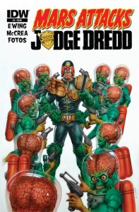
And as an aside: I am so buying Greg Staples’ cover art  (pictured) for issue #1 as a poster if it becomes available!
Review: Moth City Season 3 Part 1 – Tim Gibson

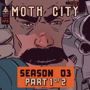
MC-Season-3-part-1_v1Moth City is almost completely unrecognisable from where it began. While writer/artist Tim Gibson warned us, introducing this series as a blend of film noir, horror and the Chinese manhua, but nothing could prepare fans for how much horror it would manifest. This issue twists the doomsday clock that much closer to midnight, blending pulp zombie fiction and family drama in a way that teases a tipping point so exciting, that readers sticking to the Comixology releases are going to have a hard time waiting. Moth City may be unrecognisable, but that doesn’t mean it isn’t better.

Gibson is right at home in the horror genre. His art style is suitably grimy, with his almost grind-house infused colour palate a perfect compliment to the blood and gore that features throughout. Again, he manages to impress with his panels that infuse motion, and his characters have become more detailed as the series has gone on. Gibson appears to have become more comfortable with the series as it has progressed, and this issue gives him plenty of opportunities to showcase that.

Speaking of characters, allegiances also have been drastically challenged since the series began. No longer is Governor McCaw a typical American tycoon, but has been built up as a father who ultimately cares for his daughter, and will stop at nothing to save both his island and family. Also a great touch is Jun, a man battling with the smart-zombie infection (all the hunger plus all the brains), whose own desire to protect his wife outweighs his want to eat her. It’s a nice play on the zombie tropes, and will definitely set up some cool moments before the series end.

And the end is near – only three more issues of Moth City remain, as the island hurtles to fever pitch. Just make sure you get on this series now, because it’s going to be a great ride.

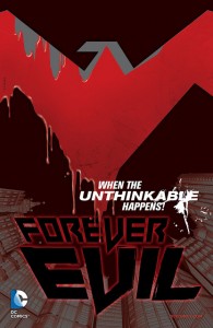
Forever Evil #1 Review – Geoff Johns & David Finch

ForeverEvil_Teasers_2_NW_R1Finally, after wading through a prelude disguised as an event (known as Trinity War), we get the main course. Forever Evil promises big – the main heroes of the DC universe are missing, presumed dead, and the newly emerged Crime Syndicate have taken their place, turning Earth into a haven for villains. But (as the marketing material is keen to remind us) evil is relative, setting the stage for something truly special – villain on villain action. And I could not be more happier.

The series is told from Lex Luthor’s perspective, and while he may be the protagonist, he is definitely far from sympathetic. Geoff Johns toes the line here – making Luthor endearing without turning him into a hero is not a simple task but, again, speaking relatively, he may as well be a saint in this event, and Johns handles Luthor’s new position admirably.

The many other villains of the DCU make appearances throughout the issue, and while the Bat-family gets the most time to shine, we still manage to get time with others, foreshadowing character allegiances. Included is a twist you may recall was used in Marvel’s own event Civil War, but if done right can really mix things up for the DC universe hero community.

There’s something to be said about some good old fashioned villains being evil. Johns, at least initially, really nails the whole vibe of the Crime Syndicate – these guys are pure, kryptonite snorting evil. This is the rare case where over the top is the only thing that would work in this case, and based on the first issue alone, these guys ratchet it up to eleven. That being said, they seem to be pushed to the side this issue, not giving us a whole lot of time with this group, leaving their reasoning behind, and not addressing some of the major cliff-hangers from Trinity War that possibly should be answered, but these gripes are minor if this characterisation continues this way.

Following on from this, Finch’s design of the characters is truly memorable. Each of the Syndicate members has a Justice League parallel, giving the team a sense of familiarity, while deviating from the source enough to be suitably villainous. The standout here is Ultraman, Superman’s parallel, who Finch draws subtly enough that at first glace he looks like the Man of Steel, but upon closer inspection has just enough wrong with him to know somethings up.

Outside of the characters, this issue is filled with Finch’s usual rough art style, and it completely works. A world steeped in evil lends itself well to his art style, and he imbues an impressive amount of detail to each and every panel. This is Finch drawing at the top of his game.

Forever Evil #1 sets up something quite delicious, and while it remains to be seen whether this issue is an indication of where this series will go, right now it looks as if its heading in the right direction. We’ve been burned with events already this year, but Forever Evil may just restore these stories to their former glory.


Five Cameos You Won’t See In Avengers: Age of Ultron

ROM___The_space_knight_by_OtimagLike most people I’m pretty excited for seeing Avengers: Age of Ultron, which got me thinking to some great characters I’d like to see (from either a comedic or sentimental viewpoint) make a cameo, that won’t appear in the movie unless Joss Whedon has his mind hijacked. Here they are anyway:

1.Dazzler 

She’s teamed up with the Avengers before, she has roller skates and can generate a great lightshow – surely the 3D version of Age of Ultron needs such an addition!

2. Cloak and Dagger

These guys have a potential movie in their future, so why not introduce them here? If Spiderman can’t be in the movies, then why not use some key supporting characters?

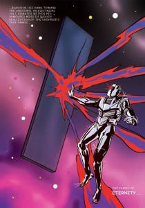
3. ROM Spaceknight

Ok, this is batshit insane but a guy can dream can’t he? I know ROM was a licensed property, but gee he deserves a huge comeback and where better than this movie?  Plus – there’ll be wall to wall silver-coloured CGI for Ultron so why not throw ROM in there?

4. Howard The Duck

Even I think this is beyond silly but had to put it out there. Maybe Whedon could finally redeem the character from a movie viewpoint though?

5. Machine Man

Hmm, I seem to have a thing about silver metal characters, but how cool could those telescoping arms and legs look?

Your turn: what cameos would you like to see that’ll probably never happen?

[pic via Otimag at deviantART]

Captain America: Living Legend #1 – Diggle/Granov

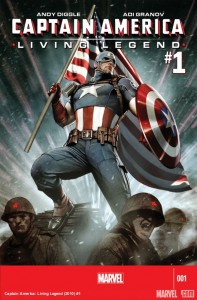
living-legendWhat is Captain America: Living Legend?

Well, three years late, is a good place to start. This four part miniseries was supposed to be released in the lead up to the Captain America: The First Avenger (albeit under a different title), and it’s been shelved ever since. Now, with Captain America: The Winter Soldier movie around the corner, I guess they figured the right time is now.

I’ve been looking forward to this title for a while, mostly because I dropped Remender’s Captain America on issue 5, not caring for his problematic, pointless, and at times out of character story, or for JRJR’s ugly art. All I was looking for in this book was a decent story and solid art – anything to wipe what’s happening in the character’s current ongoing story from my memory.

On this front, Living Legend delivers. It’s not a great title by any means, but it’s engaging and interesting enough to have me looking forward to the next issue. Diggle’s writing is solid, although the story lacks cohesiveness at times, and it’s nice to see Steve back in character again.

The story begins in 1945 Germany, skips through Soviet era Siberia, and ends up in the present day. From WWII, to space, and finally the Helicarrier. Much of the start of the issue is taken up introducing the character who will be the main protagonist, and this doesn’t leave a lot of room for Steve, but this isn’t necessarily a bad thing. It’s a good set up for the next three issues, but if #2 doesn’t feature a less disjointed narrative, then the title may be in trouble.

The issue is illustrated by the celebrated Adi Granov. He’s best known for ultra-detailed work, and that’s certainly what you can expect here. Fans of Granov’s work will be excited to see a full issue featuring his art. Sadly, I once again found myself decidedly underwhelmed. I have never been a fan of Granov’s, and while I can appreciate the technical skill, I always find it leaving me cold. His lack of expression (and I don’t mean facial) and movement, as well as his characters looking placed in their environments, rather than interacting with them, is something I struggle with. The page design is also uninspiring – although he does take some risks in places, it just doesn’t quite work.

Living Legend is also filled with his trademark teeth baring expressions, as well as almost grotesque looking characters. I was also unsurprised to see Sharon Carter looking exactly the same as just about every female character Granov has ever drawn, just with blonde hair. Interestingly, I found the less detailed panels far better. When he takes the focus off creating something photo realistic, his work can really shine.

Living Legend is a little bit of a let down, but far, far better than Remender’s current ongoing. The sci-fi element looks like it could pan out to be interesting, and Andy Diggle’s writing is nothing to sneeze at. Those who share my opinion of Adi Granov’s art, may be pleased to hear the rest of the miniseries will be illustrated by Agustin Alessio, so here’s hoping there’s more dynamic movement between panels next issue.

Over all, definitely worth a read if you’re a Cap fan, but don’t set your expectations too high.

Review: Agents of S.H.I.E.L.D. Season 1 ep. 2: 0-8-4

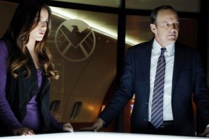
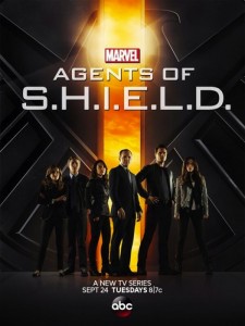
SHIELD-6After the cliché laden clunker that was the pilot episode of SHIELD, you can imagine my trepidation going into the second episode. Despite my concern, however, I do like to give every new series three episodes before deciding whether or not I’ll continue watching on a week-by-week basis. As I also mentioned in last week’s review, I had a hope that without Joss’ direct input, the series could improve past the snark and heavy handed references.

The bad news is, the episode doesn’t start off on the right foot, with some VFX that just don’t quite look right – even for a TV show – and a fairly stereotypical ‘hero has to get out of impossible’ situation, followed by ‘[insert arbitrary timeframe here] hours earlier’. So far, so average. In addition, the further we get into the episode, the more obvious it becomes that Agent Cardboard Cutout isn’t going to become any more animated any time soon.

The good news, is that while the production values are still mediocre when compared to high budget cable series (which is where the pilot episode should have been sitting, considering its reported $14m budget), the show looks far more polished this week, and looks great for a network TV show. Sets look less studio backlot, and more like they were shot on location. The visual effects are still a bit iffy in places, but are generally pretty good, and the acting has improved vastly.

The great news, is that this episode is engaging. It’s clever, witty, and self referential in a way that doesn’t whack you over the head with an embarrassing desperation to please all the fanboys (and girls) this side of Jupiter. While many will look at the script and see huge similarities between the pilot and 0-8-4, the major difference here is subtlety. Lines are delivered in a far more low key manner, rather than with a comical, over the top facial expression, and a tone dripping with irony. While the writing team was hanging lampshades all over this episode (particularly in reference to Skye’s place on the team), rather than expecting to hear a ba-da-boom-tsssch drum punchline, they garner a chuckle, and a smile.

This episode is fast paced, fun, and a little silly in places, but not so much that it becomes tiresome. Last week, I bemoaned the likelihood of getting something like Burn Notice or Covert Affairs, with a bit more grittiness thrown in. This week, we got the next best thing – something that resembled a cross between Burn Notice and Covert Affairs. Enjoyable, episodic but with the undercurrent of a longer plot, and with a slight feel of guilty pleasure about it.

Jed Whedon, Maurissa Tancharoen, and Jeffrey Bell have done a great job of the script. There are still a few moments where I could have struggled to suspend my disbelief, but the whole episode is so nicely put together that I found myself not caring. I was particularly impressed with the dramatic shift in the quality of the acting, and if this is down to David Straiton’s direction, then I applaud him. Where most of the actors felt like they were reading from an autocue during the pilot, in 0-8-4 they actually feel like they’ve learned their lines sooner than two minutes before walking on set. Agent Cardboard Cutout is still a weak link, but at least he sounds like his accent isn’t something I put on after a few too many drinks on a Saturday night.

One real revelation for me was Skye. While in the pilot, she felt like an attempted replacement for Darcy Lewis (who, if you’ve read the Thor: The Dark World prelude comics, you will know managed to hack SHIELD without much preamble), in 0-8-4 she’s really settling in to her character. Her place on the team is called into question a number of times, including by herself, and at the end of the episode we start to get an inkling of her real motivations.

The rest of the team (apart from Cardboard), are also well characterised and acted. Melinda May’s woman of few words personality is reinforced, and I’m really excited to see more about how she came to be who she is. Fitz and Simmons are more of the same high speed talking over the top of one another, and despite Skye being the clear attempt at an audience surrogate, I can’t help but relate to these two far more.

I’m a little uncomfortable with the obvious attempt at creating sexual tension between Skye and Cardboard, when there’s very little chemistry between the actors. Suggesting that Cardboard will become her trainer towards the end of the episode doesn’t help with those reservations. I just have my fingers crossed that they’ll subvert this somehow and move on. Or more to the point, I hope my theory on the conversation between Agent May and Agent Cardboard is correct, but you’ll have to wait to find out what that is.

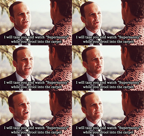
Coulson is firmly back in character, benign expression in place, dropping the odd terrifyingly efficient threat. It’s great to see him get a bit of history, with Leonor Varela guest starring as Peruvian Commandante Camilla Reyes, with whom Phil has an history of not much working. Go Phil, you dog!

It’s a relief to see the name drops and references delivered with far less of a feeling that the actors are winking at the camera. While a bunch of existing MCU characters and ideas get nods in this episode – the device they’re recovering is supposedly based off the HYDRA WWII weapons from CA:TFS – they fit nicely into the flow of dialogue, and actually got my brain ticking over with ideas, rather than being the basis of an eye roll.

I have a few theories on some of the carrots that are continually being left dangling in front of the audience’s noses, like Coulson’s magical time in Tahiti, and this episode has me actually excited to find out what the reveals are going to be.

Fast paced, enthralling, and excited for more. The plot is still predictable, but not irritatingly so, and the characters are no longer all one dimensional caricatures. I’m so thrilled to see such a dramatic turnaround after such a disappointing pilot. If it werent for Cardboard, 0-8-4 would be getting a solid 9/10, but as it stands…

Rating: 8.5/10 – the .5 is for the cameo at the end

Super Corporate Heroes Vol. 1 Review – Miguel Guerra & Suzy Dias

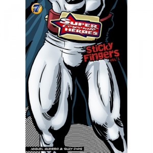
super-corporate-heroesSuperheroes as a form of celebrity culture isn’t a new thing. Many examples come to mind: DC’s Booster Gold, Mark Waids Insufferable, each dealing with the other side of being a superhero – making money. But neither title really tackles the corporate culture head on – well not like Super Corporate Heroes. It asks a completely new question: what if superheroes were on a payroll, and would only save you if you paid up? Miguel Guerra and Suzy Dias provide this take on the superhero culture, and while it falls victim to some minor flaws, it becomes something fairly unique to the genre.

As mentioned before, Super Corporate Heroes follows a group of superheroes under the payroll of Superhero Inc. These are men and woman who don’t do it for the altruism – this is for fame and fortune. The series follows the day to day lives of these heroes – the sleazy, arrogant American Icon, the woman of steel Ms.Titanium, the somewhat anatomically correct human spider known as Spinlar – each of these heroes fulfill an archetype from many of the big two publishers’ rosters. While at times they are amusing parodies, like Spinlar ,who spins his web from his back side, other times they can be quite blatant, like the Wolverine-esque Meerkat, and the less than subtle references become more of a distraction than bringing anything to the table. Despite this, Guerra and Dias manage to create a well-rounded cast of characters that at times elevate things higher than simple parody.

Where this comic really shines is the situations these characters are placed in. While at times the moment-to-moment dialogue feels uneven, jumping from 1960s hammy to more modern characterisation, the events that take place are often a treat. From the victim of a mugging who is torn between being mugged (which is cheaper) or paying up to the local hero to save him, to the disgust a bank has toward being saved by Spinlar, the moments can be incredibly amusing to see play out.

At times the themes move on from simple satire, to deeper exploration of economics in our society. Questions of equal pay between male heroes and female heroes, lack of funding to more basic emergency services, and small businesses unable to pay insurance are all brought up. It’s a welcome depth to the idea of a corporate culture and superheroes, and while these really only get touched on briefly, it’d be great to see more of these topics dealt with as the miniseries moves on.

The art on the other hand is a mixed bag. While it certainly invokes strong ties to the square-jawed, simply designed heroes of the Silver Age, the detail in the facial features appears a bit off. Faces seem to be oddly placed, and occasionally characters are contorted in such a way that looks weird. Backgrounds are also lacking, keeping to a bare minimum of detail, and never really giving the comic a sense of place outside of generic city-scapes. The art overall isn’t bad, but it never becomes anything more than a fairly simply drawn book.

Super Corporate Heroes surprised me, and that doesn’t happen too much these days. Its relevant satire of the global economy elevates it higher than many other comics in its genre, to create something that both entertains and intrigues more than you’d think.


Jupiter’s Legacy #3 – Millar and Quitely

jupiterslegacy03FIThe long wait between issues two and three of Jupiter’s Legacy have paid off in a big way. Mark Millar has upped the brutality in this current issue while Frank Quitely contributes another off the chart visual performance. Even with the extended wait, it’s hard to believe we are only three issues into this story. It reads more like an event than an ongoing series when you consider the densely populated super hero universe and the sheer magnitude of power possessed by these two warring factions – you really get a sense of the scope and ambition of this book.

Bringing an air of realism to a super hero book is not a new concept – we have seen it many times from Watchmen to the more recent Invincible but there is a modern world pathos that Millar brings to Jupiter’s Legacy that is absent from some of these other works. The degradation of the family unit, the rampant drug use and tanking economy all touched on here by Millar lend more than a gritty realism when looked at through the lens of social criticism. It takes on a biting satirical edge in much the same way as Burgess did in A Clockwork Orange, however we are dealing with human society as it effects the super human, which is an altogether new and different perspective.

There is something voyeuristic about this narrative in that it feels like we are watching a family fall apart. On a much larger scale we are witnessing events unfold in the super hero community that will have ramifications reaching every corner of existence. The conflict here is like a presidential campaign on steroids – both sides have their own deeply held beliefs and motivations, some are more altruistic than others but in a world where might truly makes right, these ideals are only as strong as those who hold them.

Millar does an excellent job writing dialogue for these characters. Although these are new characters, he has given us a look inside them through his sharp, intelligent dialogue and made them feel familiar. Their interaction and collusion paint an accurate portrait of just who these people are and what drives them to do the things they do. The narrative is briskly paced to say the least – events happen in rapid fire succession, sometimes leaving us to wonder if there’s going to be a return to that plot thread later or are we to fill in the blanks ourselves – which can lead to confusion or a point being muddled where it should be crystal clear. This is a complex story full of subtext and sometimes that can get lost in the fast tempo. However, I think Millar is doing a fine job of balancing the fast pace of the narrative with the abundance of information presented – I would just recommend reading these issues more than once to really get the most out of the lush contextual landscape.

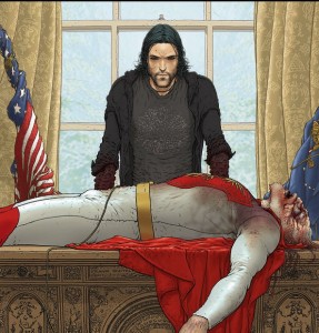
Frank Quitely is the perfect artist for the realistic super hero story. His clear and concise portrayal of anatomy is enhanced by his knack for dynamic perspective and posing within a panel. Quitely is a master visual storyteller – he employs the location almost as much as the characters as a conveyance device for the plot. Those of you who have read my reviews of his work know that I am an unapologetic fanatical fan of Mr. Quitely’s work, especially when he and a certain Grant Morrison collaborate to make comic book magic, so it should come as no surprise at all to hear that I was floored by his work in this issue. There are so many incredible pages but one of the gruesome highlights would have to be the splash page of Grace’s brutal murder.

She is twisted in pain and pierced multiple times by numerous weapons – swords and arrows obliterate her abdomen as her life blood gushes from the cruel wounds of her ferocious assault. The whole thing is a study in slaughter. Another such page shows Brandon astride his freshly murdered father surrounded by his new team mates while his manipulative Uncle Walter stands beside him with his misguiding hand upon his nephews shoulder. The once powerful and majestic Utopian lies lifeless, his face now a smoldering skull with two bottomless pits where his eyes, a father’s eyes, once beheld the world and all he held dear. Quitely expertly captures the emotion in this scene with subtleties like the inclination of Brandon’s head as he gazes up at his uncle and the consternation in Walter’s face as he looks to a future that he will shape from the shadows. Peter Doherty’s dynamic colors add a vivid depth and dimension that truly enliven these pages.

Millar and Quitely have fashioned a world where super heroes are not immune to the problems that tear families apart. Jupiter’s Legacy does not lack action, excitement or a compelling and engrossing narrative that keeps you wanting more – it has all of that. This is a world that is not hindered by past continuity conflicts or preconceived notions of how a character would or should act. This is a new world, but a world no less full of situations that shock and surprise by their very nature – not by juxtaposing behaviors or contrasting norms, but they are shocking simply by the brutal finality that result from them.

This is a comic book that doesn’t pull any punches however it does not need to be reined in for being gratuitous or needlessly indulgent. There is a balance here that is not so easily maintained – just look at a book like Crossed and you will see just how hard this balance is to maintain and how awful a book can be when it goes careening off the tracks and into the world of pointless violence and depraved sexuality. Jupiter’s Legacy is first rate across the board and for that reason as well as the myriad merits mentioned in this review. I give this issue my strongest recommendation – add this title to your pull list ASAP.

So until next time, see you at the comic book store.

Review: Marvel’s Agents of S.H.I.E.L.D – Pilot

agents of shieldWhen I first saw the teaser trailer for Marvel’s Agents of S.H.I.E.L.D (which will from here on be referred to as SHIELD), I wasn’t impressed. While the internet was going crazy over it, I was sitting in my own little bubble of dislike, hoping what I saw as dreadful clunky dialogue wouldn’t be an indication of the entire script.

Despite my misgivings, I was excited for SHIELD. I was hopeful that the trailer was simply a ploy to get those who enjoy Joss Whedon’s trademark pop culture saturated dialogue, delivered by a mismatched team of Whedon box-tickers, to tune in. That in the actual pilot, the clichés would be kept to a minimum, and instead the show would be a taught, tense, action-drama.

Suffice to say, SHIELD lived up to the wrong expectations. Not only is the entire pilot an endless string of [supposedly clever] one-liners, barely managing to hold together the melodrama and paper thin plot, the acting is sub-par, and it doesn’t work as an introduction for those not already well versed on the Marvel Cinematic Universe – believe it or not, the entire world hasn’t seen every instalment of the cinematic behemoth. Viewing this show without favour is tough, but if you ignore the good faith of the MCU, and don’t let the Whedon fans sway your opinion, the writing is on the wall. SHIELD Isn’t great. I’m not even sure I can stretch to call it mediocre.

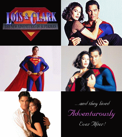
What I wanted from SHIELD was something like Burn Notice or Covert Affairs, with a bit of Breaking Bad grittiness, but this is network TV, so I would have been more than thrilled with an Alias vibe  (the TV show, rather than the comic). What we got, was NCIS crossed with Eureka (thanks to @myleftkidney for this analogy). There was also an underlying sensation that this show could have been a failed nineties attempt to compete with Lois and Clark: The New Adventures of Superman.

Lois_and_Clark_Animation

Don’t lie, you remember it fondly.

SHIELD opens with narration, which is common for a pilot episode . The narration is also an indication of the quality of acting throughout. I’m not sure how to describe Skye’s (Chloe Bennet) opening monologue, other than dire. Not only is it badly written, it’s overacted, and doesn’t at all have the tone you would expect of underground journalism, which is what this is supposed to read as. It does however, inform us that SHIELD has been made. There are people who know about the organisation, even if they aren’t aware of their exact operating capacity, and that conspiracy theorists are keen to get their claws into any leads they can dig up.

We’re introduced to the pilot’s main plot point straight away, just like any other procedural. The plot point is Michael – a juiced up black dude who isn’t Luke Cage, played by J. August Richards.

No seriously, that’s all this guy is. A  inner city black guy cliché with little to no personality other than he’s an angry factory worker single father, who got fired and is now enhanced by something called Project Centipede. He’s also the only character in the whole pilot that doesn’t look like they stepped straight out of a fashion catalogue – clothes, makeup and all. He’s basically the worst kind of vaguely racist black guy trope there is, and this continues right to the end of the episode.

Everyone else is impossibly pretty, and well put together. Even Skye who is supposed to be living out of a van, exposing the conspiracies of the world, has perfect hair, and even more perfectly pressed clothes. Agent Ward (Brett Dalton) has the personality of a brick, and the scientific team of Fitz and Simmons (Iain De Caestecker and Elizabeth Henstridge), are clearly a product of Whedon’s fandom awareness – a pre-loaded ship complete with it’s own portmanteau (FitzSimmons), and brain-twin style dialogue. The only shining light of the team is Ming-Na Wen as Melinda May, who doesn’t get nearly enough screen time, despite the large hints of an interesting, if cliché, back story.

joss-whedon-strong-female-charactersConsidering Whedon’s championing of strong female characters, I find it surprising that he has apparently chosen Agent Ward as the secondary main character after Coulson (Clark Gregg), rather than Melinda May. I can’t help but feel they’re keeping things open for Cobie Smulders’ Maria Hill to come to the show full time once How I Met Your Mother has finished.

Joss has taken an idea right out of about fifty percent of MCU fanfic, and explained Phil Coulson’s survival (after he was callously stabbed in the chest by Loki) as a way to motivate the Avengers. Yawn. If I wanted that explanation I’d just head on over to AO3 and read any one of a few thousand stories with this same idea. They’d probably be better written and more interesting, too.

Continuing with Coulson,  I couldn’t help but feel that he was out of character during the whole show. We know him as a man with a singular expression, occasionally making a wry observation, or coming out with a memorably clever quote. A man with a slightly sick sense of humour, that delivers his lines with a benign, bland, almost vacant look. In SHIELD, he cracks wise every second line, smiles often, gets a bit shouty, and talks down bad guys without a megaphone in hand. Overall, temporary death seems to have changed Phil into an entirely different person. Even if he is an LMD, it’s still a bit weird.

shield-coulsonSo character wise, it’s a misfire. I can only hope the actors grow more into their roles over coming episodes, but thus far, even their accents feel fake. It’s not all bad – there are some moments where Skye is genuinely charming and a bit goofy, and Fitz and Simmons are pretty funny with their cute brand of talking over each other humour, but the good moments are unfortunately outweighed by the not so great. Is it too much to ask to have one single character that gets through an episode without snark?

Most of what I’m presuming was a huge budget, has clearly been spent on Joss Whedon’s creative input, with what was left over used to create Lola and her groan inducing reveal at the end of the episode. The visual effects are on par with, or below what we were seeing in TV shows like 24, Alias, and Dark Angel, back in the early 2000s (shows that SHIELD should be looking to for more than just visual cues).

While I have issues with the acting and visual effects, my main gripe is the writing. Like most of Whedon’s shows, SHIELD is trying very hard to be self aware. So hard, that it manages to come full circle, and lose itself in what it’s trying to be. The episode felt like little more than a bunch of snarky dialogue and in-universe name drops, strung together with various instances of lampshade hanging to get through forty-three minutes, in the hopes of snagging viewers with references to various parts of the Marvel Multiverse. There is little here to grab the interest of someone completely new to both Marvel, and Joss Whedon’s style of storytelling. I feel like the team of Whedon/Whedon/Tancharoen have forgotten that a shows success isn’t just about generating approval from an existing fanbase. It’s about gaining new viewers, introducing them to this universe, and keeping everyone interested.

Lesson #1: Don't piss off a huge part of your fanbase

Lesson #1: Don’t piss off a huge part of your fanbase

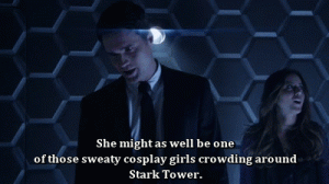
The one liners not only become tiresome, but some are downright offensive. One in particular, which I think may have been aimed at taking a dig at how we treat celebrity here in the real world, instead came across as derogatory towards female cosplayers, a problem that could have been easily rectified by having Skye call out Agent Ward’s attitude. Instead, she shrunk away and admitted in a small voice, that she was one of the fangirls he was referring to. Considering the prevalence of negativity towards women involved in geekdom, this is not at all a good message to send.

Over all, ABC has missed a golden opportunity to deliver a gritty, interesting spy drama, and has instead given us something that would have worked just as well as a cartoon. Part of the MCUs appeal, is the way it has managed to ground itself in the real world, instead of being a direct adaptation of the comics. Agents of S.H.I.E.L.D. feels like it has forgotten this in its very first episode, but it’s not until the final scene that the ability to suspend your disbelief goes from wavering to shattered.

Despite these misgivings, I am going to continue watching, if only to keep up with MCU continuity. I sincerely hope the show improves, and with the showrunning being handled by Whedon’s younger brother Jed, and his wife Maurissa Tancharoen, there may be scope for something new and compelling to come from a pilot that had more failures than successes.

Rating: 3/10

Captain Marvel #16 – Deconnick/Van Meter/Oliffe

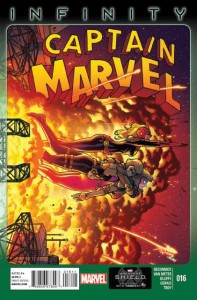
3316870-16I’m not entirely sure where to start with Captain Marvel #16, and there’s two major contributors to the apathy I feel over it. The first is the art, and the second is Infinity.

Overall, this issue is completely forgettable. While the dialogue is good, I’m finding myself left almost entirely cold by Infinity as an event. I’m bored with the repetitive nature of the narrative, and I’m sad that Deconnick’s wonderful title has been sucked into it.

This month, Deconnick has Jen Van Meter on board as a co-writer, and it shows. While previously, Captain Marvel has proven to be a fresh, clever, and easy to follow title, #16 feels far more ‘Hickmannish’ (a term I’ve coined to describe anything that gets sucked into Jonathan Hickman’s endless, talking in circles, deliberately obtuse style on his current Avengers and New Avengers runs). While Hickman is the main writer for the event, I fail to see why his narrative style must creep into a title that has otherwise featured a completely different tone.

That’s not to say I didn’t enjoy certain parts of the story – although they were mostly the dialogue sections – but I sincerely hope my favourite title isn’t drawn into any major events any time soon. There is some good exposition about Carol’s Binary powers, that is a simple introduction for newer readers, but not overly repetitive for those who have been reading Carol’s story for a while. Deconnick and Van Meter cram in a lot of characters, as is usual for a CM book, but this time around it doesn’t feel as seamless as usual. I felt like there were a lot of Avengers here, whereas normally that isn’t the case.

Back to the first major problem I have with this issue – the art. There really is no way to put it other than it’s really unpleasant.

Bodies are bizarrely proportioned, there’s little to no expression or movement, and some of the facial expressions are downright bizarre. The colouring is too bright and garish, the page layouts are uninspired, and at times quite irritating.

This book does little to advance the Infinity storyline (or what there is of one – I’m still waiting for Hickman to get to the point), and really only serves as an introduction to Carol’s Binary powers.

The bottom line? Don’t skip it, because CM is a wonderful title that needs to continue, but don’t judge this series on a decidedly mediocre issue.