Review: Thunderbolts # 1 – Daniel Way & Steve Dillon

thunderbolts1Okay, stop me if you have heard this one.

A retired military general recruits a rag tag band of heroes to do what normal people can’t – to kill threats instead of  merely subdue them. They work above the law to bring down their targets any way they can. No, they’re not the A-Team. It’s Marvel NOW!’s new Thunderbolts, courtesy of writer Daniel Way and artist Steve Dillon – and it’s nothing we haven’t seen before.

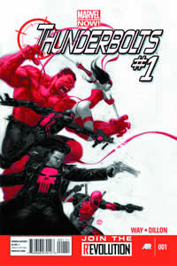
Thunderbolts #1 sees General Thaddeus Ross, A.K.A Red Hulk, recruit an elite team of killers: Deadpool, Venom, Elektra and the Punisher, to take down threats in ways that the other heroes wont condone. That’s it. There aren’t any other events that occur in this issue; no real motivations, no hint at what is to come – it’s just plain boring, and doesn’t do well to set up the series to come.

The character “interviews” – Ross finding the recruits as they are on their own jobs – set up the meat of this issue, and while the dialogue is good at times, what they have to say isn’t all that interesting. Having Deadpool fight a gang of mimes is suitably Deadpool-y, and the Punisher gets some good time, being suitably brooding and angry, but everything else is just there.

Steve Dillon’s art really doesn’t sell the issue either. I don’t mind Dillon usually, but he isn’t working at his strengths this time. The faces look like someone hit them with a frying pan, and in one panel, Ross looks exactly like the Punisher just with grey hair and a beard. I’m a bit upset that Dillon chose to forget Marco Checchetto’s badass Punisher design, and instead went with a more classic approach akin to his previous run on the Punisher, but that’s a minor quibble, especially in comparison to his rendition of Red Hulk. It looks like an abomination, and not in the right way.

Thunderbolts comes out of the gate very poorly. It’s clichéd, boring and not very good looking . Needless to say, it doesn’t bode well for the rest of the series, and unless the next issue sets up some interesting plot threads, it’s not going to be getting too excited.
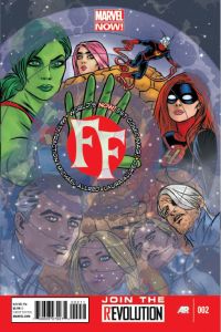
Review: FF#2 – Matt Fraction & Mike Allred

ff2“For the next two hundred and forty seconds, we are the Fantastic Four.”

Oh Scott Lang, you could not be more wrong. But it’s ok, the ride turns out awesome anyway.

FF#2 picks up right after the second issue of Matt Fraction’s other tie-in, Fantastic Four, as Marvel’s First Family begin their trip to the unknown universes. Events make a turn for the worse back on Earth, as Scott Lang and the Future Foundation learn that the new Fantastic Four’s stint will be a lot longer than expected. Fortunately for us, it makes for a fun story.

Fraction’s biggest strength in his other acclaimed series Hawkeye, the dialogue, carries over into FF. From Scott’s slight horror when he realises that the Fantastic Four aren’t coming back, to She-Hulk lamenting the loss of her Stella McCartney outfit; each of the character interactions are brilliantly handled. Without spoiling anything, if you aren’t laughing at a few of the excellent lines in this book, you need to check your pulse.

Dana Deering’s transformation to Ms Thing also comes to a head within this issue, and while the marketing seems to be building her up to act a bit like a bimbo, she often comes across as less like a an airhead, and more of an ordinary person thrown into extraordinary events. While it seems that Fraction is trying to make her likeable, she doesn’t come across as even remotely annoying – just a bit naive.

Once again the art pairing of Mike Allred and wife Laura looks as great as ever. There is a particularly stunning moment when the Mole Man and his beast appear to take on the Future Foundation, which shows that the Allreds know a thing or two on how to create fantastic looking monsters. The series so far harkens back to old Silver-Age comics, and is a treat to read.

One other problem that plagues this issue is that it almost requires you to read the Fantastic Four as well, as the events pick up immediately after the second issue of that series. Hopefully that is something that will change in the coming issues, with the Fantastic Four embarking on their journey, but readers of only the FF series will have a harder time following what is going on.

Despite issues regarding extra reading, FF  again continues to impress, both in story and in visuals. If Fraction and the Allred’s can keep this momentum going, while allowing FF to stand on its own, this book will be one to watch in the coming months.

Review: ‘Hellblazer: Dangerous Habits’ – Garth Ennis and William Simpson

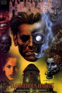
350px-Hellblazer_-_Dangerous_Habits(Note: The Hellblazer: Dangerous Habits TPB collects Hellblazer issues 41-46)

Dangerous Habits is the one of the best character studies of John Constantine. It deals with all elements of his flawed character: his hard alcohol and cigarette abuse, his exploitative use of friends, and his con-man status to the many ethereal beings of our universe, from both heaven and hell. It also shows the progression of the often morally grey anti-hero, as he deals with coming to terms with his eventual death at the hand of one of his many vices: his much loved pack of silk cut cigarettes.

For the uninitiated, John Constantine (pronounced Con-stan-tyne, as in fine) is a British occult magician/con-man/ arsehole who is modelled after the famous musician Sting. Known for his drinking and smoking habits, as well as his dry wit, he has been a mainstay of Vertigo Comics for well over twenty years. Dangerous Habits marks the entry of Garth Ennis to the series in 1991, and is widely regarded as one of the greatest Hellblazer storylines since the series’ inception. It deals with Constantine’s newfound knowledge of his terminal lung cancer, and as he says goodbye to the ones he loves, he formulates a plan that will at the very least, see him die swinging.

This story arc is Hellblazer at its most poignant. Constantine’s quest for redemption with what little friends he has left sees him backed into a corner as he fights for what little time he and his dying allies have. From the liver cancer-stricken Matt, to his old friend Brendan Finn, each allow Ennis to delve into the tortured mind of our anti-hero as he comes to terms with his mistakes, and all the friends whose deaths he blames himself for. John Constantine is a person hiding behind the con-man persona – too afraid to get close to anyone he cares about for fear of their safety. This story breaks down Constantine to his bare minimum: a man who despite his sins, wants to leave with having done more good in the world than wrong.

It is also to Garth Ennis’ credit that he chose lung cancer as Constantine’s downfall over a more supernatural curse as it both humanises and undermines his place in the world. Here is a man who deals with some of the most powerful beings in the universe, only to be taken under by one of the most basic of diseases. It allows Constantine to reflect on one of the of the most interesting issues faced in life:  this is not how, and when, I planned to go.

Ennis also allows Constantine to show off his expertise as a con-artist, as the final stages of the story arc culminate in potentially one of the most badass displays of arrogance ever witnessed in comic form. He manages to pull off the most impressive cons I have seen in potentially any medium, and it leaves the series in an interesting place by the arc’s end.

The art in this arc is merely serviceable to the story presented here. On one hand, William Simpson’s drawings can be equally weird and fitting, as Constantine’s world is one part disgusting to two parts dark. On the other hand, certain panels that focus solely on characters look plain bad – their distorted faces resemble closely those of demonic caricatures, as odd angles and stretched faces lead the reader to often be looking up the nostrils of Constantine.

As mentioned, Dangerous Habits marks Garth Ennis’ entrance into the series and it is heralded by a bang, as he systematically sets up the title character to die, exploring Constantine’s own demons, while allowing him to battle some monsters as well. While Simpson’s art may not be up to par with the writing; the Dangerous Habits storyline manages to create not only a powerful part of John Constantine’s own story, but a classic in comic books overall.

Review: Wolverine #49 – Rob Williams & Laurence Campbell

wolverine-number49-192x300My favourite Christmas movie of all time would have to be Die Hard. While it may not have the wholesome family fun and good morals that make up a typical Christmas film, it’s still a film set on Christmas Day and most people would agree that qualifies it. So when I heard that the current (Volume 3) series of Wolverine had an issue that was often described as Wolverine meets Die Hard, I got pretty darn excited. How hard would it be to mess that up? As it turns out, it’s not hard to mess up at all.

Wolverine #49 opens with Logan being forced to Christmas shop at the behest of Kitty Pryde as he makes a stopover in New York. The mall he chooses to shop at also is being visited by Toulouse Lexington, the daughter of a very wealthy man, who is then kidnapped by a gang masquerading as a Santa act. Usual kidnapping antics ensue, as Wolverine attempts to save the day.

If that description sounds derivative and clichéd to you, it’s because it is. Nothing here is even remotely unique to Wolverine’s character, and he could have easily been replaced by any number of superheroes within Marvel’s catalogue, or even John McClane himself. We barely see him, and his powers only become handy twice in the entire comic – even then a number of other heroes could have dealt with it too. It almost seems that writer Rob Williams had a basic story ready for whenever he had the chance to fit in a hero he was working on at the time.

That’s not to say any other parts of his by-the-book hostage story are particularly good either. The gang who are clad in Santa and Elf outfits have the privilege of having the stupidest name a gang could have: “the Black Christmess”. They jump from having one motive to a completely different one later in the story, and any attempt at making them even remotely sympathetic is lost. There is even a small sub-plot regarding the heiress and her relationship with her estranged father that is picked up, and then promptly forgotten. Nothing here feels particularly fleshed out, despite the fact that most of the issue is characters explaining themselves, leaving the action in the back seat.

Laurence Campbell’s art isn’t too bad – the environments are well detailed, and he has some fairly cool action shots thanks in part to Kris Justice’s colours. But the side cast all look like fairly generic stock characters, except for the heiress Toulouse, who actually looks like a librarian rather than the daughter of a wealthy business man.

Wolverine #49 is a poor attempt at making an action story set during Christmas. There is little action to keep you entertained in the mess of a story that could easily have its characters switched out without you even realising it. If you want to watch a man kill hundreds of terrorists on Christmas, stick to Die Hard. Wolverine #49 is definitely not worth your time.

Review: Hawkeye #6 – Matt Fraction & David Aja

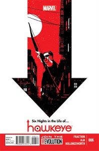
Hawkeye6-197x300I once told a friend regarding Hawkeye that if Matt Fraction spent an entire issue dealing with Clint Barton doing the laundry I’d love every minute of it. It seems I almost got my wish in the special Christmas themed Hawkeye #6, which, for half the issue, is Clint trying to get his DVR to work. But that is the beauty of Matt Fraction’s run on Hawkeye –  although this issue also deals with the Russian Mafia and a crisis of faith, the best parts of this issue, and in this series in general, isn’t always the action. It’s the heart.

It’s almost Christmas time in the apartment that Clint Barton a.k.a. Hawkeye lives. Over the next six days, he will deal with with a broken satellite dish, A.I.M., the Tracksuit Mafia and his own DVR.  As he deals with the issues of owning his own apartment (reluctantly bought off the Russian Mafia back in issue #1), Clint must also ask the question: can a man who is trying to do good, still end up making things worse?

This is how the heart makes its way  into Hawkeye. Clint Barton is a normal, regular human being. Granted; a regular human being who is also the greatest sharpshooter alive, but Matt Fraction taps into the human side of his psyche, stripping away the “heroic” traits of a super hero comic, and drawing on the more everyday experiences of this Avenger. We see him desperately try to avoid spoilers to his favourite television show, convince a neighbour his name isn’t Hawkguy, and try to clean his apartment. It is these moments that give the issue its charm – Clint is a normal human being, and acts like so. Even the cameos from other famous Marvel heroes give them more grounding features that most other writers gloss over.

That’s not to say that this issue skips over the heroic. The Tracksuit Mafia (or as I like to call them the “Bro Mafia”) return, intent on reclaiming their lot back. We meet their leader this issue, after a few surprisingly unsettling panels, which prompts Clint’s crisis of faith.

David Aja’s art, combined with Matt Hollingsworth’s colours look absolutely sublime. The wonderfully expressive faces thanks to a simple art style, combined with the flat colour palette and striking purples, make this one of the best looking comics all year. The layout also looks absolutely stunning, as Aja manages to fit more panels than one would think possible on a single page. It also helps that there is a nod to the old X-Men Arcade game that looks fantastic. Aja’s work on Hawkeye just looks brilliant overall.

If you haven’t picked up Hawkeye yet, let me ask you a question: what is wrong with you? Go and pick up the first six issues and get lost in the world of Clint Barton. Give these people money to make more comics – just so I can see that laundry issue.

Review: Batman #13 – Scott Snyder & Greg Capullo

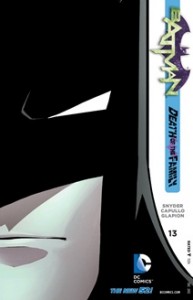
batman13Ask any fan of Batman comics who they think the Dark Knight’s greatest nemesis is, and you’ll be sure to hear The Joker’s name more than once. The quintessential Batman villain, The Joker has always been the other side of the same coin, a product of similar tragedy that turned him into a murderous madman. So when it was announced that Scott Snyder and Greg Capullo were bringing a new story featuring The Joker, especially on the heels of his fantastic character study of Bruce Wayne in his previous arc “The Court of Owls”, it wasn’t hard to be intrigued.

The stage for Batman #13, which marks the beginning of his new story arc “Death of the Family”, takes place a year after the events of Detective Comics #1. The Joker had allowed his face to be removed by another villain known as The Dollmaker, and he returns a year later beginning a series of ‘greatest hits’ – previous crimes that were perpetrated in famous Batman stories of the past. As we soon learn though, his motives are much more sinister. These events don’t end up as Bruce expects, and it hurtles towards a fantastic cliff-hanger at the issue’s end.

Snyder creates a wonderfully dark entrance for the Clown Prince. The inner monologue of the Batman, combined with his uncanny ability to channel The Joker’s demented dialogue to a tee, helps create a truly dark and twisted story. Snyder manages to instil a true sense of dread and horror within the pages of Batman #13, especially in a chilling assault of the Gotham P.D. at the onset of the issue. The horror isn’t merely blood and gore either, as the Joker’s dialogue throughout the sequence is truly evil and terrifying. Without spoiling anything, you’re going to want to look under your bed. While many of the stunts resemble fairly “standard” (whatever that term may mean in this case) Joker crimes, it sets the mood for how the arc will play out, and still leaves the reader guessing where the action will end up next.

Synder also works in a subtle character moment for the Dark Knight in this issue. As he communicates with the rest of the Bat-family about The Joker’s return, you learn that he intends to keep details, and even the investigation itself, between him and his nemesis. It is a moment where you realise that Bruce either wants to protect the ones he loves, or is willing to bank on his own skills and hubris to bring The Joker down, which is an important theme tackled in the “The Court of Owls” arc. It’s interesting that Snyder chose to revisit this theme, considering that Bruce Wayne should have learned his lesson in “The Court of Owls”, and it will be interesting to see how it will play out.

Greg Capullo’s pencils combined with Jonathan Glapion’s colours gives the art in the issue a strong resemblance to the Batman: The Animated Series of the late 1990s. It’s suitably graphic without relying too much on gore, and when The Joker’s face is finally revealed, it will give you chills down your spine. Its dark and twisted, and it really works.

It should also be worth mentioning that picking up Batman #13 without any previous interaction with Snyder’s run will be of no real detriment to the story he is writing here. While it may drop in a couple of references to his previous encounters with The Joker, it only requires a base understanding of how the villain works.

When Scott Snyder’s run on Batman moved towards the event “Death of the Family”, and the inevitable return of the Clown Prince of Gotham,  the questions were asked regarding whether this new take on this villain would live up to the standard set by The Killing Joke, and other Joker tales of times gone by. After Batman #13 perhaps we should begin to ask a new question:

What if the “Death of the Family” is better?

Review: All New X-Men #1 – Brian Michael Bendis & Stuart Immonen

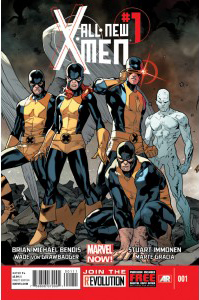
all-new-x-men-1-marvel-nowI’m a sucker for a good time travel story. Most of my favourite works of fiction deal with the concept of time travel, and I can’t seem to get enough of it. So when Marvel announced as part of their Marvel NOW! relaunch that All New X-Men would find the original five X-Men; Beast, Angel, Iceman, Jean Grey and Cyclops, taken from the past and brought to the future to help talk down one of their own from committing mutant genocide, my interest piqued. Fortunately for everyone,  Brian Michael Bendis sets the stage for what will be one of the most interesting titles in coming months.

All New X-Men #1 picks up right after the events of the Avengers vs. X-Men event earlier this year. Professor Xavier is dead, murdered by a Phoenix-possessed Cyclops. This leaves the school renamed as the Jean Grey School for Higher Learning under the leadership of Wolverine. New mutants have been popping up all over the globe, as Cyclops’ X-Men move to start the “mutant revolution”, leaving a trail of regular human-beings in their wake. Wolverine’s X-Men soon discover that desperate times call for desperate measures, as they are forced to retrieve the original X-Men in hopes they would be able to save the mutant race from once again being caught under the prejudices that the series was built on.

Bendis brings the feelings of prejudice and fear for the mutant race back on to the table easily. While not allowing humans to be outright  assaulting the new mutants, the sense of fear and dread, even to one mutant who can save lives with his touch, is palpable throughout the book. This title may say New X-Men, but these are classic X-Men themes.

The characterisation takes a back seat for the first issue, as Bendis first seeks to set up the world post AvX. The only character who is given any real spotlight  is Beast. With his opening monologue, we learn that the idea of travelling the space-time continuum was not something he has taken lightly. The rest of the characters take a back seat to action and story – with the notable exclusion of Wolverine, this initial outing seeks to set up events to come rather than showing the characters who will take part.

Stuart Immomen’s art, coupled with Marte Garcia’s colouring, gives the entire issue an animated feel. The action panels have a sense of momentum, and his art in the more talking moments gives each event their proper due. While his work may not necessarily stand out, it still looks fantastic, and suits the tone of the book well.

All New X-Men #1 succeeds fully in introducing the new status-quo for our favourite mutant family. While the first issue is light on character, its heavy themes, and the set up for the time travelling X-Men gives the coming months much promise for the title.

Plus did I mention that it has time travel?

Review: FF#1 – Matt Fraction & Michael Allred

ff-number1What could possibly go wrong in four minutes?

Potentially a whole lot, as the first issue of the Marvel Now! relaunch of the Fantastic Four series deals with. Reed Richards is taking a year to travel the space-time continuum with his family, which equates to four minutes Earth-time, under the pretence of an educational field trip. As we learn though in both this issue, and in Fantastic Four #1, his motives are a lot more obscure. In the Fantastic Four’s place at the head of the Future Foundation, Richards recruits Ant-Man, She-Hulk, Medusa and newcomer Darla Deering, who will eventually become known as Miss Thing.

Matt Fraction pairs each of these new members of the Future Foundation with the current Fantastic Four, as each character recruits their replacement for when they take their intergalactic field trip. He manages to create some memorable character moments in these pair-ups, most notably from Reed Richards/ Ant-Man, and Johnny Storm/ Dana Deering, as each of these tackle the Fantastic Four’s choices of replacements believably. While the way the recruitment of Miss Thing makes sense in regards to Johnny’s character, we don’t know yet how Dana’s transformation to her Miss Thing persona actually takes place. It initially sets up for a very interesting turn of events as we learn how this will eventually come about.

FF#1, as with much of the Marvel Now! titles, is an excellent starting point for new readers, as Fraction disperses talking-heads moments with each of the children of the Future Foundation, explaining how and what this organisation is out to do. This makes for a simple jumping on point, as well as allowing fans of Jonathan Hickman’s previous run on FF a quick refresher.

Michael Allred produces some truly beautiful work in this issue, channelling 1950s pop art brilliantly, even going so far as to incorporate a “dot press” effect in one panel that invokes a classic comic book style. It complements the tone of the story well, as its camp and light-hearted nature is felt throughout the entire issue.

Fraction and Allred have succeeded in introducing us to the world of the Future Foundation, and the acting members of the Fantastic Four. FF is set up to be a series that invokes a feeling of pure pulp fun. That’s something that can be forgotten all too often, and it’s this issue that reminds us that these titles still exist.