Hoodlum #1 Review – Hilary Goldstein & John Toledo

hoodlum
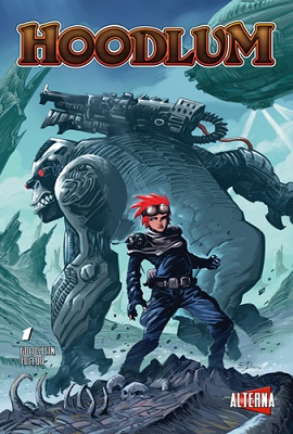
Most indie comics I have read in the past few years try to start small, with small casts and simple settings. I’m not talking about the large indie titles like Saga or Nowhere Men, but the smaller ones that slip under the radar like Rachel Rising. Hoodlum #1 takes one look at the more traditional indie titles that play it safe and decides to go in the other direction. Hilary Goldstein and John Toledo cultivate an ambitious start to a unique series, which despite sometimes feeling overwhelming in parts, is a great start for a new writer.

Hoodlum is the story of Riley Brennan AKA Hoodlum, a young thief living in a world where a demonic race runs the government, and look down upon the humans as a lesser race. She’s a regular Robin Hood-like character, stealing from the fascist demon overlords and giving back to her own community. The world is one part magical and one part steam-punk with a bit of high school drama briefly thrown in, and it is very unique. Goldstein manages to set up Hoodlum‘s world and first arc quickly, which at first glance is dense, but it is refreshing for the story to be getting right at it.

Characters throw around slang and colloquial sayings that at first are overwhelming, but once you get into the groove of things it feels natural, as the dialogue ends up being top notch when you finally get used to it.

Toledo’s art is impressive and has an amazing amount of detail in every panel, from character expressions to the environments themselves. While detailed, it can be a bit confusing at times, with so much detail making it hard to distinguish items in the environment, making me believe that the art would have benefited from a colourist or thinner lines. That said, Toledo still manages to impress.

Hoodlum#1 is a fantastic start for a new indie team. While at times it seems that the creative team may be biting off a bit more than they can chew, it’s still an impressive first outing for Goldstein and Toledo, and makes me interested in what is to come.

Score: 7.5/10

Webcomic Wednesday – His Face All Red

Hello and welcome to Webcomic Wednesday! Each week I take a look at a webcomic and let you know what I think about it. This week I’ve been on a bit of a horror-story kick, so I’m looking at Emily Carroll’s short comic from 2010 His Face All Red.

0801

I’m a huge fan of horror in any form, and while much of the genre finds itself occupied with gore and violence, the horrors that stick out the most to me play with fear as opposed to shock. Emily Carroll’s His Face All Red not only manages to create feelings of fear and mystery but also rewards the reader’s intelligence in a way that creates a satisfying tale in the short time it occupies.

It’s hard to talk about His Face All Red without spoiling any key plot points and any of the twists, but it follows an unnamed protagonist who is tasked, with the help of his brother, to kill a beast living in the forest beside his town. The story takes twists and turns that are fantastic, and Carroll’s handling of the tale is masterful thanks to her ability to show rather than tell.

Through her art and implied dialogue we learn important character beats without it being outright stated to us, and in the incredibly short form it works to the story’s benefit. The eschewing of any actual violence also lets the imagination do the work, which creates an uncomfortably gothic tale. The art, which at first feels like it won’t service the tale, allows the more horrifying parts to stand out due to its “nice” style, and in the end complements the story well.

His Face All Red is a short one, but it’s a fantastic story. So few stories are able to portray character beats and horror in such little space. You can find it here, and more of Carroll’s work on her site.

Have any webcomics you want me to check out? Let me know on my twitter @Pipes815, or send me a message via our contact form.

Webcomic Wednesday – Moth City

Hello and welcome to Webcomic Wednesday! Each week I take a look at a webcomic and let you know what I think about it. This week I’m taking a more local route and checking out Moth City, a digital comic from Wellington based creator Tim Gibson.

Moth City Webcomic Review

I’m guessing that probably ninety percent of my comics are purchased digitally through the Comixology app. In much the same way that my gaming library is mainly composed of Steam-bought titles, my comics library is very much relegated to my iPad. Despite the popularity of the app – Comixology regularly boasts as being the top grossing for in-app purchases- very few companies make interesting use of the format itself outside of a few examples (last year’s  AvX: Infinite series is one example).

Tim Gibson’s webcomic Moth City not only embraces the digital realm as a means of distribution, but capitalises on the possibilities that print comics cannot. In short, Moth City is an evolution of the comic form.

Moth City very rarely remains static. Panels often shift and change; eyes will move, lights will flicker. It even allows the reader to focus on the image at times before the speech bubbles appear. It’s not only an economy of space – each panel allows for more than one action to take place – but it looks stylish as well. It feels more akin to a motion comic, except it lets the reader move at their own pace.

Alongside the motion, the building of the page panel-by-panel as you click lets the story feel like you are watching a film. Gibson appears to direct the action – at certain points only a small part of the panel will be shown before it expands out to show the bigger picture. It gives more freedom for storytelling, rather than filling the page with clutter with panels showing a step-by-step, it allows for more information in one panel to be taken in. It lets the reader focus on what’s important before pulling back to show the big picture.

Use of digital format aside, Moth City is a great read. A noir crime drama set on a Chinese island in the 1930’s, it moves at a brisk pace, full of suspense and action. Almost at the end of it’s first “season”, Moth City is building towards an exciting finale, injecting equal parts mystery and horror into the latter half.

The art is strong, with a dark colour palette that compliments the tone of the story. Despite the changing nature of panels, Gibson takes into careful consideration how the action should show, like the lights dimming over a character, and this attention to detail is a treat to see. Moth City knows its unique format, and moves to work with it.

Like I mentioned before, Moth City is nearing the end of its first season next Monday, and you should definitely check it out before then. It’s the evolution of an art form, showing the potential of digital comics has, and it’s an exciting future.

It’s updated every Tuesday and Thursday NZ time, and you can check it out here.

Have any webcomics you want me to check out? Let me know on my twitter @Pipes815, or send me a message via our contact form.

Review: Batman “Death of the Family” – Scott Snyder & Greg Capullo

Batman Death of Family Review(Note: the Death of the Family arc compiles issues 13-17 of Batman)

When I reviewed Batman #13, the first issue of “Death of the Family”, back in December, I posed the question of this arc’s place within the Dark Knight’s story hall of fame. Would it be able to stand up to the likes of The Killing Joke or Arkham Asylum: A Serious House on Serious Earth, some of the greatest works in comic history, or would it pass by leaving the Batman mythos largely unchanged? Following the conclusion of the arc in Batman #17 less than a week ago, it’s safe to say that not only is this a fantastic look at the Batman- Joker relationship, but leaves the entire Bat-family in an interesting predicament.

The Joker takes centre stage for the arc, and the creative team make sure you know it. Capullo pulls no punches in creating a truly terrifying rendition of the character – his face rots before the reader’s eyes in horrifying beauty. This is some of Greg Capullo’s best work on Batman – the Joker’s face pulls and twists as events play out, and Capullo manages to portray emotions of a man who lacks many of the features that people actually need to do so. It’s twisted, disgusting and beautiful all at once.

Art elsewhere is also a treat. Aside from the Joker, there are many other gruesome scenes that colourist FCO Plascencia and Capullo craft excellently. Alongside the story beats, Bruce Wayne’s emotions run wild in this arc – Capulo shows anger, desperation, and sadness, seemingly with ease. I’m a huge fan of his take on an enraged Batman, and this is delivered in large doses.

In the end, art wouldn’t matter if the story wasn’t up to the same standard. Thankfully Scott Snyder delivers in producing one of the most interesting takes on the Joker/Batman dynamic. Snyder places Batman on a pedestal for the Joker, showing an almost fanatical love for his nemesis, much in the same way a patriot would love their king. The Joker feels that the Bat-family drags Batman down, that his family isn’t what makes Batman – it’s the Joker that does. The Joker honestly believes he understands Batman better than anyone, and that his plan will restore his “king” to his former glory. It’s a sick and twisted love story – and just in time for Valentines Day.

Snyder also creates tension with Bruce’s understanding of his nemesis as well. He holds his family at arms length, feeling that his understanding of the Joker is what can save them, and that this is something only he can handle. The way Bruce deals with his family is patriarchal, and leads to some great moments of tension.

These events all come to a head in an explosive final showdown, providing one of the most memorable exchanges between these two characters. Not only does it highlight their relationship in a succinct manner, but it also provides character development that I honestly did not expect to see. Without spoiling anything, this is best exchange between the two since The Killing Joke. Hands down.

When The Death of the Family finally reaches its phenomenal finale, it wont be what you expect. Snyder successfully manages to defy the expectations of what a status quo changing event can be, setting up a new world for Bruce Wayne to deal with. Snyder and Capullo’s take on the Joker  is not only one of this creative team’s best stories, but one of the best Batman stories ever. This is what events in superhero comics should aspire to be.

Score: 10/10

My Pull List: Sean Robinson

UntitledMy Pull List is a regular look at the comics we regularly read. Each time we’ll get one comics lover to detail the books they can’t do without month to month. If you’d like to be a participant,drop us a line!

So since David posted his pull list already, I thought I should share mine. Now I know that I gush about a few series in particular, so some of these won’t be a surprise, but since I’m sure there’s a bunch of new readers to share with. So without further ado, here are my top 5 from my pull list.

1. Hawkeye: Seriously. How many times do I have to tell you? GO. BUY. HAWKEYE. The story of Hawkguy is great, and I think that every single comic fan should give Matt Fraction’s story a chance.

2. Star Wars by Brian Wood: It’s only been one issue, and I’m completely sold on this title. Brian Wood’s Star Wars takes back to the events after A New Hope. The Clone Wars were only a brief mention, and the Rebels were on a high note following the destruction of the Death Star. It tells all new stories about the classic gang leading up to the events of Empire, positioning Leia in a leading role. It’s pretty thanks to Carlos D’Anda, and has heaps of promise.

3. Saga: Another one I’m keen on gushing about, it was my favourite comic series of last year. It’s really quite something, and after nine issues, only gets better. Love it.

4. Comeback: I’m a huge fan of LooperOh and time travel. So this 5 part film noir mixed with time-travel is a dream. Time travel is merely a plot device, in a good way making way for a crazy story full of twists. It’s 3 issues in so pick it up now to be on the train for it’s end.

5. FF: There’s a reason Matt Fraction’s name is the biggest name in our tags section (other than the fact I’ve reviewed three issues with his name on it). He is that great. So are Mike and Laura Allred who are on art duties. The eclectic cast would probably have been crazy with any other creative team, but it works and it works well.

So those are my top pulls. In a month or so, I’ll check back in to show you what has changed, but in the meantime tell us yours – flick us a message with a little bit of info about yourself (first name and rough location at least), and we’ll profile you in coming weeks.

Webcomic Wednesday – Three Word Phrase

Hello and welcome to Webcomic Wednesday! Each Wednesday I’ll highlight a new webcomic, and let you know why I like it so. This week I’m looking into one of the more weird webcomics I frequent, and that is Ryan Pequin’s Three Word Phrase.

bath1

Let me just say it right off the bat, Three Word Phrase isn’t for all ages. Pequin’s seemingly insane ramblings often veer into NSFW territory, and while not every comic has a dick joke or deals with more mature material, a good portion do. So don’t show it to your kids.

Plus I say mature, but I guess this comic is anything but. Pequin seems to put whatever odd thought crosses his mind that day into an artistic for, and it yields unpredictable results. Whether he’s replacing the words pop or pope for porp; or he’s talking about Gregor the man who wakes up one day to find out he’s a bug, only to live a normal happy life, no subject remains untouched.

This can lead to a very hit-or-miss approach to his writing, as some comics seem better left to the confines of his mind. But when Pequin hits gold, it is at its most beautiful. This won’t be a comic for everyone (especially kids) but it’s worth a try.

You can find the insane, yet unique ramblings of Three Word Phrase here. They’re short and sweet, so give it a shot.

Have any webcomics you want me to check out? Let me know on my twitter @Pipes815, or send me a message via our contact form.

Webcomic Wednesday: Nimona

Hello and welcome to Webcomic Wednesday! Each Wednesday I’ll highlight a new webcomic, and let you know why I like it so. This week I’m taking a look at Nimona, an ongoing series by Noelle Stevenson, about the exploits of super villain Balister Blackheart, and his devious apprentice Nimona.

nimona-image

Nimona is an interesting beast. The tales of Balister Blackheart and Nimona are somewhat different from usual villain based comics. Each prove themselves quite likeable, despite being villains – but that’s how Noelle Stevenson wants you to feel. Blackheart is an honourable man, was once a hero in training, falls victim to betrayal, and finds himself on the other side of the law. He’s surprisingly compelling and deep, and for a short weekly comic strip to get that point across is no mean feat.

Nimona on the other hand is mischievous and childish. She’s a shapeshifter, and upon convincing Blackheart to let her be his sidekick, revels in being a villain. She’s somewhat murderous, but still manages to have heart. Blackheart is a paternal figure in her life, and while she wants to let chaos loose, adheres to Blackheart’s no kill rule. It’s a neat mechanic that makes the villains feel like heroes.

Nimona’s art is also pretty neat. It’s simple and quirky, but compliments the tone nicely. Plus there is an awesome panel in a later strip that has some cool pop culture stars hidden in the background.

There is one little downside that isn’t really a downside. It’s a bit of a wait each week for the next instalment, and it reads better when read as a complete chapter, but that speaks volumes to how often I do end up checking it.

Noelle’s little captions also really complete the package. It’s totally awesome. Nimona is updated every Monday and Thursday. You can check it out here.

Have any webcomics you want me to check out? Let me know on my twitter @Pipes815, or send me a message via our contact form.

Review: Thunderbolts # 1 – Daniel Way & Steve Dillon

thunderbolts1Okay, stop me if you have heard this one.

A retired military general recruits a rag tag band of heroes to do what normal people can’t – to kill threats instead of  merely subdue them. They work above the law to bring down their targets any way they can. No, they’re not the A-Team. It’s Marvel NOW!’s new Thunderbolts, courtesy of writer Daniel Way and artist Steve Dillon – and it’s nothing we haven’t seen before.

Thunderbolts #1 sees General Thaddeus Ross, A.K.A Red Hulk, recruit an elite team of killers: Deadpool, Venom, Elektra and the Punisher, to take down threats in ways that the other heroes wont condone. That’s it. There aren’t any other events that occur in this issue; no real motivations, no hint at what is to come – it’s just plain boring, and doesn’t do well to set up the series to come.

The character “interviews” – Ross finding the recruits as they are on their own jobs – set up the meat of this issue, and while the dialogue is good at times, what they have to say isn’t all that interesting. Having Deadpool fight a gang of mimes is suitably Deadpool-y, and the Punisher gets some good time, being suitably brooding and angry, but everything else is just there.

Steve Dillon’s art really doesn’t sell the issue either. I don’t mind Dillon usually, but he isn’t working at his strengths this time. The faces look like someone hit them with a frying pan, and in one panel, Ross looks exactly like the Punisher just with grey hair and a beard. I’m a bit upset that Dillon chose to forget Marco Checchetto’s badass Punisher design, and instead went with a more classic approach akin to his previous run on the Punisher, but that’s a minor quibble, especially in comparison to his rendition of Red Hulk. It looks like an abomination, and not in the right way.

Thunderbolts comes out of the gate very poorly. It’s clichéd, boring and not very good looking . Needless to say, it doesn’t bode well for the rest of the series, and unless the next issue sets up some interesting plot threads, it’s not going to be getting too excited.

Review: FF#2 – Matt Fraction & Mike Allred

ff2“For the next two hundred and forty seconds, we are the Fantastic Four.”

Oh Scott Lang, you could not be more wrong. But it’s ok, the ride turns out awesome anyway.

FF#2 picks up right after the second issue of Matt Fraction’s other tie-in, Fantastic Four, as Marvel’s First Family begin their trip to the unknown universes. Events make a turn for the worse back on Earth, as Scott Lang and the Future Foundation learn that the new Fantastic Four’s stint will be a lot longer than expected. Fortunately for us, it makes for a fun story.

Fraction’s biggest strength in his other acclaimed series Hawkeye, the dialogue, carries over into FF. From Scott’s slight horror when he realises that the Fantastic Four aren’t coming back, to She-Hulk lamenting the loss of her Stella McCartney outfit; each of the character interactions are brilliantly handled. Without spoiling anything, if you aren’t laughing at a few of the excellent lines in this book, you need to check your pulse.

Dana Deering’s transformation to Ms Thing also comes to a head within this issue, and while the marketing seems to be building her up to act a bit like a bimbo, she often comes across as less like a an airhead, and more of an ordinary person thrown into extraordinary events. While it seems that Fraction is trying to make her likeable, she doesn’t come across as even remotely annoying – just a bit naive.

Once again the art pairing of Mike Allred and wife Laura looks as great as ever. There is a particularly stunning moment when the Mole Man and his beast appear to take on the Future Foundation, which shows that the Allreds know a thing or two on how to create fantastic looking monsters. The series so far harkens back to old Silver-Age comics, and is a treat to read.

One other problem that plagues this issue is that it almost requires you to read the Fantastic Four as well, as the events pick up immediately after the second issue of that series. Hopefully that is something that will change in the coming issues, with the Fantastic Four embarking on their journey, but readers of only the FF series will have a harder time following what is going on.

Despite issues regarding extra reading, FF  again continues to impress, both in story and in visuals. If Fraction and the Allred’s can keep this momentum going, while allowing FF to stand on its own, this book will be one to watch in the coming months.

Webcomic Wednesday: JL8

Hello and welcome to Webcomic Wednesday! Each Wednesday I’ll highlight a new webcomic, and let you know why I like it so. For our inaugural week I’d thought I would introduce you to a personal favourite of mine: JL8

JL-8-Image

Imagine your favourite Justice League characters, but they’re eight-years-old. That is JL8 in it’s most basic form. What that doesn’t tell you is how well realised each of these children are. They’re the Justice League, in all their heroic glory, but they also are just kids who deal with school in such a way that doesn’t detract from their adult counterparts. Batman is still a brooding paranoid kid, and Superman is a morally upstanding citizen, but they still have to deal with bullies, girls, and family. It constantly references the DC universe, while also giving out great moral lessons, making the comic feel like a great Saturday morning cartoon for kids, but with just enough referential humour to appeal to the parent. It’s fun that isn’t observed enough in the DC line-up these days, which makes it a nice change from the usual serious business that our heroes have to face.

Plus it is just so gawd dammed cute.

Check out JL8 here, it’s updated every Monday and Thursday.

Have any webcomics you want me to check out? Let me know on my twitter @Pipes815, or send me a message via our contact form.