Review: Young Avengers #7 – Kieron Gillen & Jamie McKelvie

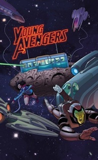
youngavengersFull disclaimer – I have never read the much-loved original run of Young Avengers from a few years back. It slipped right past me, and I have always intended to pick it up. So without this preconception, I picked up the first arc of Young Avengers a few weeks back, and haven’t looked back. This title is absolutely fantastic, and with issue 7, it looks like its only going to get better.

Writer Kieron Gillen has managed to create a superhero team that doesn’t feel quite so self important like the other Avenger crews. Too often in those larger titles the world feels like it’s the only thing at stake, and everything is written with that in mind rather than a more closer threat. With Young Avengers this isn’t the case. Their enemies, while equally universe-spanning, feel a lot more personal rather than an attempt at destroying the planet – and with the events of issue 6 setting up a fairly terrifying villain who has taken one of their own – it feels like these heroes are merely trying to get by rather than looking for danger. It makes the series feel more realistic, with the threat being a danger to the team, not some mustache twirling super-villain’s attempt at a new world order

Gillen’s more grounded storytelling transfers over well to the characters. Each individual character acts like you’d imagine a group of 18 year olds battling personal dilemmas like having sense of worth and managing powers. Not only are their issues real, but the dialogue feels real also. These are a bunch of teenagers who react to each other, and the language reflects that –  these are kids who are stuck with one another, so it’d make even the most quiet of people want pick on one another.

The story in this issue is mainly about having the pieces fall into place. The team is approached by Prodigy, who gives Wiccan information about his brother, who is seemingly absorbed by an inter-dimensional being. As they move to stop him, they find themselves about to pass through other dimensions to do so. There isn’t a great deal going on, but if Young Avengers can be this good on a slow issue, it’s even more brilliant on a better one.

Speaking on brilliance, Jamie McKelvie rivals Hawkeye‘s David Aja in art duties and panel design. From his impressive work on his Tumblr-esque recap page, his breakfast menu credits page, or his Facebook photo reel, each page brims with smart design and great art. His character designs, while were initially a bit too realistic for my liking, and felt like a Saturday morning cartoon, have grown on me and I take back all of that. I absolutely adore McKelvie’s work.

In fact I adore the entire series. Gillen and McKelvie’s smart design and storytelling have elevated this series to one of Marvel’s best, and one of my favourite series so far. Lets all hope it lasts longer than its predecessor.
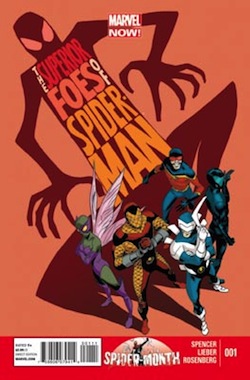
Review: Superior Foes of Spider-Man #1 – Nick Spencer and Steve Lieber

The-Superior-Foes-of-Spider-Man-1Another double header review from Sean and Shawn – enjoy! – Ed.

Sean Robinson’s Take

Superior Spider-Month kicks off over at Marvel Comics on an interesting note. Superior Foes of Spider-Man #1, is actually anything but Superior – in a good way. Taking a leaf out of Hawkeye‘s book, this story of the new Sinister Six (minus one) focuses less on an overarching threat, or a long form tale involving the team’s titular nemesis, and instead on the day to day lives of this band of C-listers. While it doesn’t seem to come out swinging of the gate quite as well as Hawkeye did, it still manages to be a good time.

Nick Spencer decides to focus on Boomerang AKA Fred Myers for the first issue, and if you have no idea who that is don’t worry. Spencer sets out to tell everyone who Boomerang is, and in turn makes him that little bit more human. It’s an important, and easily overlooked concept that if handled badly could make this book about villains hard to get into. Granted, by focusing on Boomerang it then overlooks the other members of the team which doesn’t necessarily sell the issue as a team based book, but it doesn’t hurt it here.

The story at hand, with Boomerang trying to get his team a job, is fairly straightforward. It does give a bit of an insight into the team dynamic, and positioning the team as a matter of necessity rather than a close knit group of friends does set up for some fun banter, and the dialogue elsewhere, especially in the flashback, makes for some truly funny moments. It even gives the story a Lucky-esque dog character that I hope has more play in future issues.

Lieber’s art is also pretty good too. His use of symbols in the speech bubbles, for background noise  or the animals is a particularly neat design choice, and he manages to express characters well. His art style is well suited for a mainstream superhero-comedy title, realistic but exaggerated enough to portray humour. While not as visually impressive as other titles out there it does serve it’s purpose.

Superior Foes of Spider-Man #1 gives the reader – aside from the long-winded title – a fun comic. While I have been throwing that word around a lot, especially in regards to Hawkeye or FF, it manages to get up there in being a title that doesn’t take itself too seriously, which is something that Marvel has been doing a lot lately. But while this issue does manage to channel the right emotions – it doesn’t quite reach those two in quality. Hopefully when the team dynamic gets underway will we see another truly great title from Marvel.

Shawn Warner’s Take

Another Marvel team book is not so news worthy in these “Uncanny” days but when that team consists solely of villains, that can generate some interest. Throw in the fact that these villains are all enemies of The Superior Spider-Man and Marvel just might have another hit on their hands. Not since Norman Osborn headed up Thunderbolts and Dark Avengers has there been a true villain-centric title at Marvel. In fact, Jeff Parker recently wrapped up Dark Avengers and the current Thunderbolts though made up of characters like Deadpool, Punisher and Venom cannot truly be called a team of villains. The success of Secret Six at DC is indicative that there is a fan base for a book like this. The only question I have is what took so long?

Superior Foes of Spider-Man is a bit of a misnomer; these guys are only superior in their ineptitude. They are Marvel’s answer to the cast of Seinfeld – they are a team of D-listers and that is where this disarmingly charming book comes into its own. Boomerang is a down and out ex-baseball player cum swindler who from his current locale behind bars, runs a team of equally bumbling miscreants. They have dubbed themselves the New Sinister Six despite the fact that there are only five of them as yet. Speed Demon and Shocker shoulder much of the comedic load and they do so with the savvy of a seasoned Vaudeville duo. Beetle is more concerned with social media than what’s going on during “team meetings” and Overdrive is the consummate wheelman. These two team up to knock off a comic book store in one of the books funniest scenes full of Nick Spencer’s razor-sharp dialog.

Oddly enough for a Spider-Book debuting during Superior Spider-Month, there is not a single panel featuring Spider-Man, Superior or otherwise. This did not present a problem for me. I thoroughly enjoyed this book much in the same way I enjoy Hawkeye. Now before I get crucified for blasphemy against Hawkguy, let me explain. Both books are very stylish in design – Steve Lieber’s artwork is slick and his old school page layouts have a retro sensibility not dissimilar from Aja’s work on Hawkeye. As for the writing, Nick Spencer and Matt Fraction have taken characters otherwise overlooked by most comic book readers and thrust them into the spotlight. The stories are full of excellent dialog and quirky characterizations written at a snappy pace, with lots of action to boot.

This is only the first issue, but there is so much potential and so many unmined plot gems to be discovered in these vastly unexplored characters – Nick Spencer has his work cut out for him. The team dynamic for a group of cutthroat backstabbers is going to be a joy to develop I’m sure. Then there are the countless solo mis-adventures for each of these characters. I look forward to Shocker and Speed Demon crossing paths with just about any Marvel hero but Deadpool immediately comes to mind. The quips, one-liners and obscure pop culture references boggle the mind. Then of course there are the inevitable run-ins with Superior Spider-Man himself, who just happens to be the former head of the Sinister Six.

I have become a big fan of Nick Spencer, his work on Secret Avengers is something I look forward to every month, so I am extremely happy that Marvel has given him another ongoing monthly series. This book is fun and full of all the things that make comic books thrilling and engrossing. Spencer has the unique opportunity to move these characters from obscurity to centre stage in the 616. Although the events do take place in continuity, this book is not bogged down by that fact. It exists alongside the world of big events – Infinity is even referred to when the Origin Bomb is mentioned.

Steve Lieber is a perfect choice for this book. His style is polished and very hip. He has an eccentricity that comes through in the way he renders a scene right down to the posing and anatomy of the characters within a panel.

I found The Superior Foes of Spider-man to be wildly humorous and absolutely enjoyable. Visually and textually relevant, I whole-heartedly recommend it to anyone who likes some criminal hijinks and first-rate writing and artwork with their laughs.

So until next week, see you at the comic book store.

Review: Avengers A.I. #1 – Humphries and Araujo

avengers-a-i-1And so we begin with the Age of Ultron spin-offs, this one featuring Hank Pym, Vision, Monica Chang, Victor Mancha, and a Doombot. Despite AoU’s truly dire final issue, this seemed like an interesting combination. I love Vision, I find Hank a very interesting and important guy – when he’s written well, and I was interested to see how they would develop Monica as a character in the primary continuity (if you don’t read Ultimates, she’s the current Ults Black Widow).

So… Sam Humphries, who is best known for taking over from Jonathan Hickman on Ultimates, is the writer on this one, and I really only have one word for almost everything he does here.

No.

No no no no no.

No.

To be honest, there’s also some other words that come to mind, but they aren’t appropriate for a review that isn’t preceded by an adult content warning.

I’ve read some other reviews, and I can’t help but wonder… did we read the same book? I hated this book so much that if it had been a physical copy instead of a digital one, I would have burned it ceremonially, and buried the ashes with a small piece of cardboard as a headstone proclaiming here lies what remains of Dr. Henry Pym’s character.

Hank’s no saint, we know this. He’s a mentally unstable, obsessive narcissist, and thanks to that artist’s drawing mistake, he’s also one of the most controversial characters in Marvel’s line-up. But hey, when the writer gets him, he can be very compelling. I think he’s often written badly, but when he’s written well, he’s one of the most interesting and complex heroes out there.

noSam Humphries takes the subtle nuances of his persona, and exaggerates them, turning him into a wisecracking, smarmy, egomaniacal dickwad, who has already apparently forgotten how his out of control A.I. nearly destroyed humanity. I mean, come on. The Avengers almost destroyed reality to repair the mess that was AoU – and yes, as mentioned, Hank is obsessive about his creations. But this is just ridiculous.

What is with writers trying to make characters ‘cooler’ or ‘more interesting’? What is wrong with writing characters in the way that we’ve come to know them? Why can’t someone with a a mental illness be written like a person with a mental illness, instead being turned into a socipoath? While you may think that assertion is a little over the top, that’s exactly the vibe I got from Hank here.

The other characters… whatever. I don’t really care. Steve pops up for a page, and basically tells Monica to let Hank do whatever he wants… I mean what?

I just can’t fathom what is going on with the characters in this book. It’s truly horrendous. The only shining light here is Doombot, who is reasonably amusing, if underused, as a reluctant hero.

What about André Lima Araújo’s art?

Ugh. It’s horrible. Vision looks like a green and yellow brick with some appendages sticking out, the colouring is dull, and everyone’s faces are wonky and flat. Bodies are out of proportion, the page design is snooze-inducing, and all the characters look incredibly young. Where others have praised the action sequence, all I see is a lack of movement, and far too many static panels meant I got very bored very quickly

Over all, it was a real struggle to get through this book. I put the misinterpretation of Hank’s character right up there with Remender’s work with Steve at the moment (Uncanny Avengers, and Captain America), and sadly, it means I won’t be continuing with this title.

Review: Batman & Superman #1 Greg Pak, Jae Lee & Ben Oliver

batman-superman1I am in complete agreement with a whole lot of sentiments being thrown around the Internet. We need another Batman or Superman comic just as much as we need another X-Men title – they just keep coming, and there’s going to be a point of over-saturation. So when Batman\Superman #1 dropped into stores, I merely bought it because I felt I should check it out – and I’m glad I did. Greg Pak and Jae Lee (with Ben Oliver on art duties for the last few pages) have begun something that while it  doesn’t entirely break the mold in the written sense, is still a good story in among some of the most unique and impressive art I have seen in a while.

Firmly rooted in New52 continuity, Batman/Superman #1 sets up the first time the  two met. While it doesn’t initially address the continuity issue of their apparent first time meeting back in Justice League #1, Pak decides to instead have Clark Kent and Bruce Wayne first meet as Clark investigates the murders of Wayne Enterprise employees. Their initial meeting is great, as it reaffirms each of their own personal philosophies, while also pointing out the flaws as well. It’s not new ground whatsoever, but it does help to highlight that this pairing comes from two very different people.

Pak also brings back the signature double narrators that was made popular during the initial run. I’ve always been a huge fan of this form of storytelling – if it’s used correctly. Too often it can appear cluttered and noisy, but Pak doesn’t fall into this trap and manages to control this aspect well. He makes sure each character gets their due, before moving onto the next one. It works really well.

The real star of this issue is Lee’s art though. Each panel is absolutely beautiful – a soft watercolour effect mixed with a muted colour palette making the work look stunning. It’s a shame that he doesn’t do the entire issue however, as Ben Oliver steps up for the final few pages. Oliver isn’t bad by any stretch of the imagination and his work manages to hold his own against Lee, but it does feel a bit jarring when we move to a more pencil drawn approach. Just give Oliver his own title to truly show off his work and that’ll make everyone happy.

With the introduction of a more magical based villain, drawing on the back-ups of Batman in recent months, Batman/Superman is off to a great start. While it doesn’t appear to be breaking any new ground story-wise – just a standard buddy story for two of DC’s biggest hitters – the choice of artist really makes it stand out. If Pak and Lee can keep this momentum going, those qualms of over-saturation will be soon forgotten.

Eight reasons Fraction’s Hawkeye is such an important title

hawkeye-1Hawkeye is one of those rare comics that come along, and unexpectedly smash you over the head with a glowing truncheon of excellence. While that may not be the most eloquent of descriptions, it accurately describes how I felt about the first issue of Fraction’s brilliantly down to earth take on an Avenger who has generally been relegated to the second-string.

I was wary of Hawkeye in the lead up to its release, concerned that the popularity the film version of the character has found would taint the authenticity of the story existing in the primary comics continuity. I was particularly apprehensive about Matt Fraction writing another character whom I’ve always had a soft spot for, as I still had a bad taste in my mouth from the second half of his run on Invincible Iron Man.

What I was excited for, however, was the inclusion of David Aja on the creative team, and I did really enjoy the Brubaker/Fraction/Aja combination during Immortal Iron Fist. Aja has been responsible for some of my favourite panels from recent years, and I was excited to see how his simple, yet brilliantly expressive style, could work with a character I’ve come to think of as the most inconsistently drawn in Marvel Comics.

So with trepidation, I read the first issue. And then I read it again. And again. I read it four times in twenty-four hours. I gushed about it on tumblr. I stared at the art for a long time just letting the beauty of every panel sink in. I think I may have actually had tears in my eyes at one point, just because it was as close to perfect as I’ve ever seen in a comic.

But why did I feel this way? What made me actually get emotional over some drawings with some words on them? What makes this book the one on my pull list that I anticipate the most each month?

1. Fraction takes a B-lister, and doesn’t immediately turn him into a hero

Many writers’ first instincts when tackling a character, with such an historically bad ability to carry their own title as Clint Barton, would be to have him doing something epically heroic in the first issue. Taking on Taskmaster, or Zemo, or a Brood Queen,  with a toothpick and some dental floss – something MacGyver-level silly. Maybe even give him some temporary enhancement, to subvert the belief a comic about a dude without any superpowers will be boring, then take it away three issues later – which is something I sort of expected from Fraction, to be honest.

He usurps this by smashing Clint up so badly in the first two pages, that he’s stuck in a hospital for six weeks. When he does get out, he acts like a childish brat, and stops traffic by letting his wheelchair roll into the road. A page later, he’s at a vet clinic, telling them to fix up a dog that looks like it’s on death’s door.

So I guess while we do get a sense of heroism from this version of Clint, he’s still a dick. He’s still just a dude with a bow. He’s still just a guy. He lives in a building owned by the Russian Mob, which he makes a complete hash of buying in a back room casino.  He hangs out with his neighbours and barbecues on the roof, has a fight with the mobsters in the vet’s office, and then gets mistaken for Iron Fist.

Instead of putting Hawkeye on a pedestal, Fraction expertly parodies the popular audience opinion of the character. He gives us a sardonic, three dimensional, morally ambiguous Clint, and isn’t afraid to remind us that he hasn’t always been a good guy. He continually enforces the idea that most people have no idea who the hell he is, and not only is it a brilliant running gag, it also helps to demonstrate how Clint has come in possession of such a low sense of self-worth.

2. Kate Bishop

The most important thing to note about Kate is that she isn’t a former Hawkeye. She is Hawkeye. Just because Clint isn’t running around in the black and yellow Ronin outfit any more (he hasn’t been for a while, to be fair), doesn’t mean she has to give up the mantle. So we have Hawkeye and Hawkguy, and it’s glorious. The rapport between Kate and Clint is excellently conveyed, with Kate being the major thing in Clint’s life that’s keeping him on the straight and narrow, calling him out when he’s wallowing in self-pity, and telling him to stop being a loser when he needs a wake-up call.

The best part about the relationship between Clint and Kate however, is the fact that it’s strictly platonic. Any one-liners alluding to a romantic entanglement are swiftly dealt with, and serve to enforce how comfortable they are with each other as friends. Do I ship them? Uh… yeah. But am I glad Fraction’s said he’s never going to go there? Absolutely.

Kate is the glue that holds this book together. Without her, it would be good, but not great. Hawkeye isn’t just about Clint, it’s about Clint and Kate.

3. The page design

hawkeye-2Page design is sometimes overlooked when talking about comic art, which is a shame, because it’s something I’m particularly excited by. Aja’s brilliance doesn’t just extend to the the pencilling – his layouts are dynamic, interesting, and quirky. It just looks so different to most comics out there; an interesting mix of complex and simple, that is really one of the most visually pleasing reading experiences I’ve ever had. The only issue of any comic I’ve enjoyed looking at as much as this title, would be Secret Avengers #18 – Another Aja book.

The layouts of every issue, including the ones where Javier Pulido, and Steve Lieber and Jesse Hamm take over, are a great demonstration of how smaller panels can come together to convey both pace and tone. Even Francesco Francavella’s #10 – while not being the strongest art wise – has some excellent choices in the design department.

4. It’s not afraid to be high-concept

Fraction really pushes the envelope a lot with some of the storylines, and they all pay off big time. The latest issue – #11 – takes a look at the world of Hawkeye through the eyes of Lucky (the Pizza Dog). Not only is there limited discernable dialogue, but the majority of the story is told through simplified diagrams and flow charts. This could have all gone horribly wrong, but it’s the single best issue of a comic book I’ve read since Iron Age. Which is a tough call for me to make, as there have been some wonderful things on offer from many of the Marvel NOW! titles.

Every issue to this point, has taken a risk. The whole idea of trying to give Hawkeye his own title again seemed ludicrous to many – readers and critics alike – but taking the concept of exploring what Clint does when he’s not avenging, pushes Hawkeye out of the superhero genre. It inhabits a strange space where you can’t really pin any genre on it, and that’s partially what makes it so brilliant. Despite the ridiculous situations Clint and Kate find themselves in, they retain one important characteristic – you can relate to them.

hawkeye 35. Nobody lets Clint get away with his bad decisions

Here’s something that you don’t often see happen in any form of media, let alone comics. Everyone calls Clint out for being a dick. Kate,Jessica, Bobbi, Natasha… pretty much every woman in his life isn’t afraid to tell him he’s a self-destructive asshole. And while he tries to defend himself to a point, in the end, he just sits back and takes it.

You’re so wrapped up in hating yourself that any time anybody starts to care about you, or god forbid you start to care about them – you push them away —Jessica Drew, Hawkeye #9

Kate’s there to support him after that zinger, but the fact still remains, that even though everyone loves him and would do anything to help him out, they don’t always like him that much. Even Tony Stark, king of the narcissistic, self-indulgent assholes, tells him he needs to pull his head in.

hawkeye 46. Bro.

Bro. Brobrobrobro.

Bro.

7. It’s visibly contemporary

We see events from our universe bleed into Earth 616, with #7 dealing with how Clint, Kate, and their friends fare during Hurricane Sandy. It could have come across as preachy, exploitative, or opportunistic. Instead it was an incredibly heartfelt issue, focusing on the concept of family, both those we’re born to, and those we choose.

Add to that, Fraction is intent on pointing out that Clint is ageing. He’s divorced. He’s got aches in places he didn’t know he has. He’s sometimes weirded out by the fact that he hangs out with a woman who is barely twenty. You almost feel like these people could be real, living around the corner from you, and that’s what I love in any story, be it comics, books, television, or film.

8. People are people

What’s Fraction’s biggest strength at the moment? Treating every character, no matter their race, gender, sexuality, age, or abilities, as a goddamn person. No character inclusion feels forced, or accommodated for diversity’s sake. Apart from Clint, Grills, and the Russians, most of the featured characters in Hawkeye are women, but then that’s not something that’s clumsily and deliberately pointed out. It’s just the way it is.

So, while I may sing the praises of Captain Marvel, the reality is that both CM and Hawkeye are far and away my favourite books out there at the moment, holding equal places in my heart thanks mostly to superior storytelling.

Hawkeye is such a breath of fresh air, and even though most of Marvel’s crop of current titles are very good, Hawkeye is a true step forward in the superhero genre. Despite the fact that – as previously mentioned – it doesn’t really fit that label.


Captain Marvel #13 – DeConnick & Hepburn/Sandoval

Captain-Marvel_13I know I’m a bit late with this one, but I’ve had a bit of a busy week. Having something go viral is a bit of a time sucker.

Anyway – Captain Marvel 13, part three of The Enemy Within. How is it?

I really liked the story, the way Kelly Sue managed to jam a bunch of characters into the one issue was really well done, and I commend her for it. Even so, I did get the feeling it had a bit of ‘middle child syndrome’ about it – it is the middle issue, after all – and as such, it’s not perfect.

For starters, the art is becoming a serious problem for me. Most of the issue is pencilled by Scott Hepburn, but there are two pages that were drawn by Gerardo Sandoval, which wouldn’t normally be that much of a big deal, if the art was pleasing.

Hepburn’s art still has me in two minds. Sometimes I really really like it – and I particularly enjoy the way he draws Jessica’s actions – but then there are points that I dislike it so much I want to scrub it off the page. Faces are a hard to look at at times, with everyone looking a strange mixture of pinched and pouty, which is head-scratchingly irritating. Having said that, his work with poses and movement is impressive, and I found myself flip-flopping between oh my god that’s gorgeous and ugh get it out of my eyeline now please.

Sandoval’s work on page fourteen is really rather unpleasant, mostly because his drawing of Cap is overly muscled (I’m talking Liefeld levels of ridiculousness here – one of his hands looks like it belongs on Hellboy), with ugly facial expressions, and an extreme macho feel that really doesn’t fit with the tone of the book. The supporting characters in these panels are nothing special, and over all, it makes the dialogue on the pages reasonably forgettable.

Story-wise, it’s solid. Some may be confused by the jumping about, but I quite liked it. The story could have otherwise been rather flat without the dynamic aspect of quick story shifts between panels. I particularly liked Spider-Woman and Hulk in the Everglades, even though it’s only over two pages.

There’s a lull in the over all Enemy Within storyline movement, and while there’s plenty of interesting dialogue and action, the actual plot doesn’t move forward much other than to finally bring the dramatic irony aspect to a conclusion.

As usual, the strength of Kelly Sue’s character driven story is what carries this issue. Her secondary characters are dynamic, funny, and a joy to read, and while the art was at times distracting, overall I did enjoy this book. There’s a great little hint at Wendy having a crush on Bruce, Tracey is brilliantly cranky as usual, and Carol is her normal endearingly altruistic self.

Seeing as The Enemy Within only has two parts to go, I’m excited for the next issue of Avengers Assemble, and am hoping that the mini-event doesn’t end with a whimper like Age of Ultron!

Review: Age of Ultron #10 – Disappointment x 2

ageofultron10

Something a little different with this review, with both Shawn and Sean throwing their hats in the ring to have a loser look…

Shawn’s take

After ten issues of anticipation and hope for a mind blowing climax that would forever change the Marvel Universe, what I have just read is without a doubt the most disappointing event finale in Marvel history. Age of Ultron is nothing more than a sales pitch to sell more books based on this pointless anti-event – it is a proverbial snake eating its own tail. As disheartening as this issue is, it is not completely without merit – the opening pages reunite Bendis with his frequent collaborator Alex Maleev for one of the highlights but the mish mash of artists on this book destroy any sense of cohesion. All of the art is top-notch by some of the industry’s best but the way they are all thrown together give the book the feel of an ill-conceived jam.

I lost count of the sub-plots that once began were left to wither and die unresolved, like Nick Fury and his team of Avengers that were sent into the future to stop Ultron. So many plot points were touched on, only to ultimately amount to nothing or be rendered moot by the events of issue ten. The majority of the issue takes place in the past as Hank Pym reacts to a warning sent to himself pertaining to Ultron. This adds to the increasing sense of tension as the final conflict with Ultron looms ever closer. However, the disillusionment begins and once it does it never lets up. From here the encounter with Ultron takes place during the time of the Age of Ultron prologue which literally reprints Bryan Hitch’s artwork, only varying the dialogue to reflect changes that occurred during Wolverine and Sue Storm’s time travel mission and Hank Pym’s own interfering with Ultron’s brain.

The final battle with Ultron is summed up with one mighty blow from Thor. While the other Avengers stand around in what appears to be a ceremonial circle, Thor takes the initiative and shatters Ultron to bits with one swing of Mjollnir. Ten issues of posturing and false promises come to an end – but wait, there are more Age of Ultron tie-ins to hype in the remaining pages. In fact once all is said and done, the Marvel Universe we lovingly refer to as the 616 is virtually untouched by the Age of Ultron. As the final pages flip by, the highly- touted introduction of some mystery character (everyone knew who this was going to be) felt more like a last minute afterthought than an event with a nine issue build up. Anti-climactic does not begin to describe the feelings I had to contend with after reading this book. For nine issues I reserved judgment because I love so much of what Age of Ultron consisted of; it had a great writer with freedom to explore any plot he could come up with more or less, it had illustrious artists, it had a remarkable cast of characters that spanned time and space, how could it fail to amaze? For nine issues I disputed my friends and colleagues who discounted the premise without reading the first word. Now after the tenth issue I am completely disillusioned. Of course over the span of ten issues there were some inspired moments, but without a pay-off they amount to spinning wheels, they go nowhere. As lovely as many of the pages were to look at they were merely window dressing.

I am still looking forward to reading Infinity. I have not soured on Marvel or on event books as a whole, (I even liked AVX) but this just felt like a massive waste of time and at $3.99 an issue there is no excuse for an ending like this. By the last page Ultron as a threat or even as a character is forgotten. I can see no lasting ramifications that could conceivably come from the events of this book. The only real result of this fiasco seems to be that now the Ultimate Universe (which is dead already for all intents and purposes) is now slated to be victim of the ill-fated premise that is The Age of Ultron.

Age of Ultron as a whole had glimmers of genuine brilliance but they were quickly abandoned or left to die on the vine. Plot threads that would have led to a much more exciting and satisfying climax were left unexplored in favor of hackneyed and convoluted plot devices that ended in a sales pitch for more Ultronless Age of Ultron books instead of a real resolution. Visually Age of Ultron is stunning – even in the inconsistent conglomeration of fantastic artists that graced issue ten with their work, there is definitely virtuosity.  For me Age of Ultron ended up being nine issues of titillating set up with the most dissatisfying culmination. As much as I love comic books, it pains me to have so little to praise in this finale but also as a fan of comics I believe the creators that are entrusted with these beloved characters owe it to us to put out their very best work.

I don’t believe for a second that this is the best Bendis can do.

Sean’s take

And so Age of Ultron ends, in potentially the most anti-climactic way possible. Brian Michael Bendis – and the many artists he brought along for the ride – were definitely on to something. Who would have thought that a post-apocalyptic, time travel story, involving some of the biggest names in the Marvel Universe, with no telling who would live – or die – could turn out so badly? With its drawn out story, erratic use of artists, and little closure for many events that preceded it, Age of Ultron #10 flounders what could have been a truly interesting story.

Where Age of Ultron really suffers is its apparent disregard for many events it set up. Remember Captain America’s assault on Ultron’s future headquarters? The writers seem to have forgotten, as this future where Ultron is in control is never mentioned again. The four chapter build up to that moment feels wasted, and this entire arc could have easily been cut back in those issues. Echoing Shawn’s sentiment about the high price per issue, I feel like Marvel pushed for more issue to pull more money from the readers. Bendis seems to struggle with the ten issues he was given with injecting some plot points that go nowhere, seeming to exist only as filler rather than a fully-fledged storyline.

The entire issue feels like a half-baked mix of many different ingredients. The use of many different artists is difficult to follow, and while each in their own right does look good, the overwhelming mix makes the issue feel disjointed. There is a reason why they usually stick to one artist per issue, and this is a complete embodiment of too many cooks spoiling the broth.

Joe Quesada’s mysterious final pages (which were spoiled for me many months ago) do look great. It’s nice to see him drawing again, but I can’t help but feel that this mysterious and exciting reveal didn’t really need to be here. It didn’t have to be a part of this event and it makes me wonder if this reveal was shoe-horned in at the last minute, as it could have been put in almost any other title.

That’s not to say everything in this issue is bad. Like Marvel’s AvX last year, the set-up to what is to come is much more interesting that the actual event itself. The cross-over to the Ultimate Universe is exciting, and reminds me of the fantastic Spider-Men event last year. Plus the entire Wolverine/Sue Storm relationship was great, and I’d love to see Marvel pick up this again in other avenues.

None of this set up could really save this series. Age of Ultron seems to be an event for events sake. It doesn’t help that before the final issue landed, Marvel began promoting their new Thanos-led event Infinity, not inspiring confidence in their current one. The choices made through this event were odd, and plotlines were fairly quickly dropped. Age of Ultron made so many weird choices that didn’t really inspire interest, just confusion. The only question that came out of my mouth when this finished was just one word.

Why?

Review: Superman Unchained #1 – Scott Snyder & Jim Lee

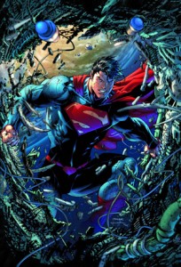
unchainedSuperman is getting a lot of love lately, and why shouldn’t he? He’s the superhero archetype, celebrating not only 75 years of his existence, but also essentially heralding the 75 years of  superhero comics as we know it. He’s got a new movie, new digital series, and now a new ongoing series – Superman Unchained. Courtesy of comics legend Jim Lee, and current superstar Scott Snyder (who we’ve established many times is killing it over on Batman), this new ongoing series is out to revitalise the otherwise decidedly mediocre current main title line-up. And boy, does it deliver.

Superman Unchained reads like a true Superman tale. We have flashy action, honest human (Kryptonian?) heart, and good old fashioned Clark Kent journalism. Following a mystery regarding satellites falling from orbit, as Superman exercises both his raw strength and journalistic skills – it’s standard fare for Kal-El and that’s a good thing. It seems like Snyder went out to make sure he hit all the right notes of  making a great Superman story and delivered. While it definitely doesn’t break any new ground, it’s 100% fun.

Snyder also manages to make it immediately accessible to new readers with only a cursory knowledge of the Man of Steel. Aside from needing to know that Clark Kent has left the Daily Planet, Snyder crafts a story that could be read by anyone, and stays true to the fiction. Lois Lane is smart and sassy, Jimmy Olsen is loyal, and Lex Luthor is… well, Lex Luthor. For the brief period each of these characters appear, you just get their character. Snyder’s grasp of the world of Superman is uncanny, and it makes you wonder why he hasn’t written him sooner.

Speaking of the world of Superman, this issue has a healthy amount of references to the DC Universe around him, not just the Superman family. Starting with a fun jab at Batman, Snyder treats this like a title within a universe, rather than just treating it like it’s own entity. It’s simple, but incredibly effective.

Jim Lee does not hold back for this issue, as we are treated to some of the more spectacular works I have seen from the artist. The issue comes with a large fold-out poster for print readers, which is treated like any other page for the digital crowd, and it looks amazing. Lee really seems to get Superman, and alongside making the New52 outfit look cool, really has a grasp of Superman’s character design. From the softly drawn quieter Clark Kent moments, to the more powerful “super” moments, Lee draws Superman brilliantly.

The only issue I have with Lee’s art is that at times it can feel a bit claustrophobic, with the more action packed sequences throwing a little too much at the page. This is only a minor quibble, as Lee absolutely kills it otherwise.

With a cool new villain set up, which leads to some interesting historical implications, Snyder and Lee have set the stage for Superman Unchained. While its first outing didn’t really break much new ground, if it is going to be this good I don’t really care. This is too much fun.

Review: Batman #21 – Snyder and Capullo

batman21Batman perhaps more than any other comic book character has had his origin examined and scrutinized, most notably by Frank Miller in his masterfully written Year One. So when Zero Year was announced I was cautiously optimistic. The fact that Scott Snyder, who has just amazed and impressed us with Court of the Owls and Death of the Family eased many of the doubts that persistently crept into my mind. Like legions of comic book readers out there, Batman is and has been since childhood my favorite character and his origin is like gospel, a subject not to be taken lightly. Admittedly most of my concerns stemmed from the continuity discrepancies that arose from the birth of the New 52. That being said, Batman was the least impacted by these sometimes drastic changes. His origin is not so much changed as it is more fully explained and some of the blanks are filled in by Zero Year. There are years in Bruce’s past that have yet to be addressed, formative years in the Batman mythos. Scott Snyder does an excellent job here of driving away the shadows that remain and linger around some of those years.

The story begins six years ago – Gotham City is in utter disarray, looking more like the Savage Land than a major municipality. Scott Snyder, more than any other writer, writes Gotham City as another character. He gives it life and personality and Greg Capullo enhances this effect by rendering the city as though it were a living organism. A child is spear fishing in the flooded entrance to the Gotham subway when suddenly he is assailed by a pair of mask-wearing thugs .He drops his fish and runs for his life. Batman shows up in a tattered makeshift uniform minus cape ,riding a dirt bike that looks like it was used in a Mad Max film. He saves the child and returns his dinner to him.

The time line jumps further – it is now five months earlier and The Red Hood makes his appearance but just who is under that hood at this point is not known. Bruce is heavily disguised and driving a truck full of men that The Red Hood is quite interested in killing for refusing to join his gang. This sets up an edge of your seat escape scene and shows a more reckless Bruce at a time when he was more likely to take chances. Bruce returns to a pre-Bat Cave headquarters which appears to be a secret room full of computers and training equipment hidden inside Wayne Manor. Here Bruce and Alfred discuss the state of modern crime fighting. Snyder is a master of writing dialogue. The conversation flows with a natural rhythm that lends a deeper level of credibility and realism. The discussion is complex without being pedantic and illuminates a deepening relationship between two friends.

Bruce’s Uncle Philip plays a major role from here on out. He shows up and takes Bruce on a drive around Gotham to show him the new Wayne Enterprises building. As an interesting detail we are shown the giant penny that we all know will come to be housed in the Bat Cave. It stands before Wayne Enterprises as Uncle Philip tells the story of overseeing its forging. He also gives us some history of the relationship between the Wayne family and the Kane family. Snyder then takes us back to a time when Bruce was a boy. He sees his father working on an old Lincoln and runs happily to him. His father looks lovingly into his eyes and what follows is some of the most revealing dialogue in the book. Bruce explains his desire to be anonymous and that his love for Gotham stems from the fact that he can be anyone he wants when he is in the city. His father then shows him a visual mapper designed by Mr. Fox to be used by fire-fighters, EMTs and doctors. It makes a three dimensional map from inside the rubble of a collapsed building or destroyed village. I can’t help but think this is going to be a significant piece of equipment in the near future, perhaps in the construction of the Bat Cave.

Uncle Philip returns for the final pages and has a conversation with a rather unexpected co-conspirator. A dark and foreboding solution is proffered to Philip’s quandary, one that echoes across time and space as we see Bruce as a boy reflected in the shiny visual mapper held in his tiny hand. In the final panel he stands contemplating a gaping hole at his feet.

Zero Year is not the re-telling of Batman’s origin that some may have been expecting. It has so much more ambition than that. Scott Snyder is writing his own entry in the history of the greatest of all comic book heroes, filling in some of the gaps and bringing the Dark Knight into sharper focus. Snyder’s engrossing and meticulous dialogue brings these characters to life. His fast paced and absorbing plot is the perfect framework for the exhilarating action sequences. Zero Year is the total package, not only does it have everything a great comic book should have but it is an endearing human drama as well.

Greg Capullo continues to deliver some of the best pages on the racks today. His hyper-detailed cityscapes and exhilarating action scenes are the stuff of comic book dreams. He has been the perfect collaborator with Snyder to bring us these stunning Batman stories. Not since Grant Morrison and Frank Quitely’s groundbreaking pre-New 52 run on Batman and Robin have I been so thoroughly and completely impressed by a creative team on a Batman book.

The back-up story is a look at a nineteen year old rebellious Bruce in Rio de Janeiro, also by Snyder this time with the help of his Talon collaborator, James Tynion IV and art by Rafael Albuquerque. The story highlights Bruce’s firm resolve to do the right thing even though his methods may seem drastic. The writing is again top-notch, the break-neck pace and snappy dialogue rocket you through the narrative in no time flat. The art is more stylized but fits the material. The flowing lines, blending colors and blurred backgrounds give you the very definite feeling of speeding through the streets of Rio. It is a short but intriguing look into another of Bruce’s formative years.

Zero Year is off to an immaculate start. Over the next year we are to be witnesses to the birth of the Dark Knight. Some of the questions we have always had about why things are the way they are in the complex mind of Bruce Wayne will surely be answered while others are more fully explained. This book is mandatory reading not only for Batman fans but for all lovers of great writing and tremendous artwork everywhere. So even if you are only a sporadic reader of the Bat-titles I would recommend jumping on at least for the next year. I’m sure you will stick around.

Until next week, see you at the comic book store. Same Bat-time…

Review: Avengers Assemble #16: Deconnick and Buffagni

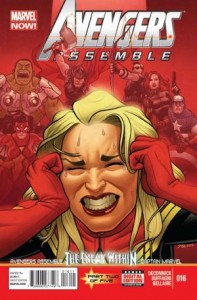
avengers-assemble-16Avengers Assemble #16 is the second in the ‘Enemy Within’ crossover with Captain Marvel, a five issue arc over the two titles, and written by Kelly Sue DeConnick, queen of the clever dialogue and character driven storyline. While this event focuses on Carol, Assemble #16 certainly isn’t wanting for other characters, with an opening scene based on a SWORD craft in orbit, and plenty of heroes featuring prominently during the battle scene that takes up a majority of the issue.

If you’re not reading Captain Marvel, then this issue probably won’t make a heck of a lot of sense. While the battle is against the Brood, the driving force behind their attempted invasion is Yon Rogg, and his personal crusade against Carol. Out of context, this could be confusing for new readers, or those who have never really followed her character’s story. It doesn’t make the issue any less fun, though.

Kelly Sue does a great job here of incorporating four different settings – a SWORD spacecraft, Carol’s apartment, a battle on the streets, and Yon Rogg’s home – while still keeping the story flowing well. While I’ve seen some criticism of the jumps between scenes or panels, I thought this was a great way to create a feeling of chaos, a parallel between the storytelling, and what’s going on in Carol’s head at the moment.

Matteo Buffagni’s art is pretty darn awesome here. Right from the first page, you can tell it’s going to be a great issue visually. The man has real talent with facial expressions, be them close up, or at a distance. I also really appreciated the design of the book. The panels interconnect really nicely, and there’s a particularly excellent and movement filled page featuring Hawkeye, that I went back to a couple of times just to look at. I really cannot fault the art at all – it’s gorgeous.

As always, DeConnick’s dialogue is witty and feels very natural. Despite this being a very Carol-centric issue, all the characters featured get some good page time, and the team dynamic that has been present in previous issues of Assemble is still very much a core focus. The scenes with the graveyard shift pair of SWORD agents, are just as engaging as those featuring the heroes we know, and there’s some great transitions between locations, particularly where Wolverine starts a sentence while slicing through one of the Brood, and then it’s finished by Abigail Brand talking to the SWORD agents currently orbiting the Earth.

All in all, there isn’t a lot of progression to Carol’s storyline here, but the action more than makes up for it. Unlike some stalwarts on the Marvel roster, Deconnick is able to craft a script that on the surface, appears to have a lot going on and keeps you interested, but it’s not until you finish the issue that you realise not much has really happened. Instead of relying on art to fill pages and panels, she uses character interaction and internal monologue, which is far more engaging and entertaining than some of the more high concept titles out there at the moment.

Assemble #16 was a great look into how Carol’s battle with both her brain lesion, and Yon Rogg’s treachery, is affecting her friends, and the world at large. It further demonstrates her inherent stubbornness, and the chaotic turn her life has taken, while enforcing the theme of friendship and teamwork.

Overall, another enjoyable, action packed issue. I can’t wait for the next in this crossover!